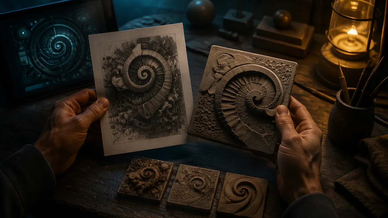
choose an AI-generated image and write a translation plan that decides what to keep, simplify, exaggerate and leave out, with thumbnail sketches of three possible clay versions.
Instruction
A translator between languages does not swap words one for one; she decides what the sentence means and finds the best way to say it in the new language. Turning a flat machine image into clay is the same kind of work. The image has color, light and millions of pixels; clay has height, edge, texture and weight. Some things will not survive the trip, and your job is to decide which.
Keep. Start by naming the one or two things that make the image what it is. It might be a shape (a spiral staircase), a contrast (a tiny figure against a huge wave), or a feeling (crowded, empty, tense). These must survive the translation.
Simplify. Fine detail is usually lost in clay at tile scale and is almost always lost to touch. Group many small things into one texture: a forest becomes one field of upright impressed marks rather than 200 separate trees.
Exaggerate. Things that are only suggested by light and shadow in the image need to become real height or depth. If the moon glows, make it the highest form on the tile; if a road recedes into the distance, you might carve it progressively deeper.
Leave out. Color does not exist in clay (until later units). Perspective — things getting smaller as they recede — is confusing to touch, because a hand feels the actual size of a form. Background clutter competes with the main forms. Leaving something out is a decision, not a failure; write down why.
Choosing the image. Use the image you chose in Lesson 1.1, by whichever of that lesson’s three routes you took: one of the three works described in the lesson’s own image set, a public-domain AI image from Wikimedia Commons, or the frame you generated yourself in the p5.js editor. All three earn full credit here. Record its label in your plan — the tool, the prompt if one is known, and the date — because honest credit for the source image is part of the work and it will matter in your statement. Whichever route you took, pick an image with a strong main shape; images that are all texture and no structure are hard to translate.
Thumbnails and a level map. Draw three small (5 × 5 cm) thumbnails that solve the translation differently: one faithful to the image’s layout, one that crops in close on the most important part, one that rearranges it. Pick one and draw a level map: shade the ground level light, the middle level medium and the top level dark. This is exactly how relief carvers planned their work.
Documenting your process. Your sketchbook is part of your grade because the thinking is part of the art. Date each entry. Include the image label, the thumbnails, the level map, test marks and notes of what you changed and why. When you write your statement in Lesson 1.5, your evidence will be here.
The test. A good plan answers one question: if someone touched only the finished tile, what would they understand about the image? Write that answer in one sentence at the top of your plan.
📖 Read for this lesson
The reading opens over the lesson; close it to come back to exactly where you were. The checks below draw on it.
Formative check
Work through these before moving on. They are not graded — they tell you whether the standard below has landed yet.
An AI image shows a road narrowing toward a distant city. Translated literally into clay, what will a person reading by touch most likely feel?
Leaving something out of your translation is a failure to follow the source image.
Upload your translation plan: the AI image label (tool, prompt, date), your one-sentence test answer, three thumbnails, the chosen level map, and a keep / simplify / exaggerate / leave-out list with a reason for each.
How confident are you that you can plan a clay translation of an image and explain what I kept and why?
Planning a Clay Translation: Technique Sheet and a Worked Plan
SLS original technique sheet and worked plan (illustrative), using an image reproduced in a U.S. Copyright Office letter · SLS original (illustrative worked example)
Why this reading. The workshop asks you to plan a clay translation of an image and to draw a level map, three thumbnails and a keep / simplify / exaggerate / leave-out list. The image is yours by any of the three routes in Lesson 1.1. This reading carries the technique sheet and a complete worked plan for one of the lesson’s own images, so you can copy the method and check your own. The plan is SLS original and illustrative.
Technique sheet
- Test sentence. Write one sentence saying what the finished tile should be a picture of. Every later choice is checked against it.
- Keep, simplify, exaggerate, leave out. Make four lists, each item with a reason.
- Three 5 × 5 cm thumbnails: faithful to the layout, cropped in on the key part, and rearranged.
- Level map. Draw a 10 × 10 grid on the chosen thumbnail (on a 10 cm tile each square is 1 cm). Write 0, 1 or 2 in every square. Level 0 is the ground slab, about 6 mm thick. Level 1 stands about 3 mm above it. Level 2 stands about 8 mm above it. Keep at least 3 mm between levels or fingers will not feel the step.
- Textures go on last, chosen from your library (impressed, incised, smooth).
Worked plan: Théâtre D’opéra Spatial
(Image described in Lesson 1.1 and in the critique dossier: dark ornamented hall, huge bright circular opening at the center, reflective floor, three gowned figures with their backs to us and two more at the right edge. Label: Théâtre D’opéra Spatial, Jason M. Allen, Midjourney, 2022; U.S. Copyright Office Review Board letter, 5 September 2023.)
Test sentence: “A crowd of small people stands in a huge dark hall, looking at one enormous round opening.”
| List | Item and reason |
|---|---|
| Keep | The circle, because the whole picture points at it. The five small figures facing it, because they give scale. |
| Simplify | All the carved ornament becomes one band of impressed short marks around the frame: 200 smears cannot be read by a fingertip. |
| Exaggerate | The circle becomes a smooth hollow, the deepest place on the tile (level 0), so a hand falls into it. The frame is the highest (level 2). |
| Leave out | Color; the faint crowd and landscape inside the circle (they would clutter the hollow); the reflections on the floor. |
Thumbnails: (1) faithful: circle above, floor and figures below; (2) crop: the circle and only the three figures below it; (3) rearranged: the circle at the bottom, figures climbing toward the frame. The plan continues with thumbnail 1.
Level map (rows top to bottom, columns left to right):
2 2 2 2 2 2 2 2 2 2
2 2 2 0 0 0 0 2 2 2
2 2 0 0 0 0 0 0 2 2
2 2 0 0 0 0 0 0 2 2
2 2 0 0 0 0 0 0 2 2
2 2 0 0 0 0 0 0 2 2
2 2 2 0 0 0 0 2 2 2
2 1 1 1 1 1 1 1 1 2
2 1 2 1 2 1 2 1 1 2
2 1 1 1 1 1 1 1 1 2
Read it: a frame of level 2 all round; a smooth hollow of level 0 shaped like a disc; a floor strip of level 1; and single squares of level 2 at columns 3, 5 and 7 of row 9 standing for the three figures. (The two more figures at the right edge are folded into the frame, a deliberate omission to note in the rationale.)
Rationale, about 60 words: “I kept the circle and the figures because they are what the picture is about, and turned the glowing circle into the deepest form so a reader’s hand finds it by falling into it. The ornament became one impressed band. I left out color and everything inside the circle.”
Check yourself: can someone reading only your level map guess your test sentence? If not, raise the contrast.
Sources: U.S. Copyright Office Review Board letter on Théâtre D’opéra Spatial, 5 Sept 2023 (copyright.gov)