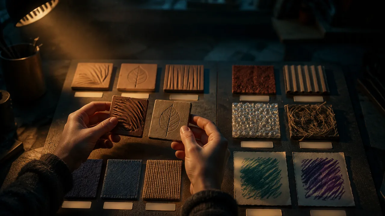
make and label a library of at least twelve textures in clay, collage, fabric and rubbing, describing each with precise tactile vocabulary.
Instruction
Painters keep color charts; tactile artists keep texture libraries. A library is a set of small, labeled swatches you can reach for when you plan a work, so you choose from tested surfaces rather than guessing. Today you begin yours. It will grow all year.
Four families of texture. You will make at least three swatches in each family:
- Clay: impressed (cord, burlap, a leaf, a comb), incised lines, carved grooves, added bumps, smoothed with a wet finger.
- Collage: sandpaper of two grits, corrugated cardboard (with and against the grain), bubble wrap, crumpled and flattened paper, string glued in lines.
- Fabric and fiber: felt, denim, corduroy, burlap, yarn coiled flat, a knotted cord.
- Rubbing (frottage): paper laid over a textured surface and rubbed with the side of a crayon or soft pencil. A rubbing turns an actual texture into an implied one, which is the opposite of what we do in this course. Make two, and notice what gets lost.
A vocabulary for touch. “Rough” is not enough. Describe each swatch on five scales: rough-smooth, hard-soft, regular-irregular (does the pattern repeat?), directional-non-directional (does it feel different stroked one way?), and warm-cool (fabric feels warmer than glazed clay at the same temperature because it conducts heat away from your skin more slowly). Add one comparison: “like tree bark”, “like a cat’s tongue”.
Distinctness. Two swatches can look very different and feel nearly the same. Test every pair with eyes closed. Research on tactile graphics stresses that textures used together must be clearly different from one another; the difference that matters is the one a fingertip can detect, not the one your eye sees.
Scale. A fingertip reads roughly the area of a small coin at once. Patterns much finer than that blur into “slightly rough”; patterns much coarser read as separate bumps rather than a texture. Make at least one swatch at three different scales of the same mark (fine, medium, coarse) to feel the difference.
Adhesives. Use PVA (white) glue for paper, card and fabric; it is water-based and non-toxic. Use a low-temperature glue gun only for heavy items, and only with an adult present. Avoid solvent-based glues and spray adhesives indoors.
Documenting. Mount the swatches in a grid on card. Number each and write its description in your sketchbook. Photograph the board in raking light; you will use these photos in Lesson 2.3 to train a machine to recognize your textures.
📖 Read for this lesson
The reading opens over the lesson; close it to come back to exactly where you were. The checks below draw on it.
Studio: The texture library
Question. Which textures can a fingertip reliably tell apart, and how does changing scale, direction or material change what a hand perceives?
Materials
- Air-dry clay and texture objects (cord, burlap, comb, leaves)
- Sandpaper in two grits, corrugated cardboard, bubble wrap, string, felt, denim, corduroy and burlap scraps
- PVA white glue, glue brushes and scissors
- Thin paper and crayons with the wrappers removed, for rubbings
- A mat board or heavy card base about 25 × 35 cm
- A sketchbook and a phone or camera
- Scissors: cut away from your body and pass them handle first.
- A low-temperature glue gun may be used only with an adult present; keep fingers away from the nozzle and the hot glue for 30 seconds after application, and never leave it on the fabric.
- Wear a dust mask if cutting or tearing sandpaper, and wipe grit off the table with a damp cloth.
- If you have latex, wool or other fiber allergies, leave those materials out or wear gloves.
Procedure
- Cut twelve or more 5 × 5 cm squares of card as bases and number them.
- Make at least three swatches in each family: clay, collage, fabric and fiber, and rubbing.
- Make one mark (for example string lines) at three scales: 2 mm, 5 mm and 10 mm spacing.
- With eyes closed or the swatches under a cloth, have a family member hand you pairs; working alone, put the swatches face down in a bag, shuffle them and draw two at a time without looking. Record whether you can tell them apart, and how sure you are.
- Glue the swatches to the base board in a grid, strongest contrasts spread across the board.
- Describe each swatch on the five tactile scales in your sketchbook, and photograph the board in raking light.
Data
| # | Family | Rough-smooth (1-5) | Hard-soft (1-5) | Regular? | Directional? | Warm-cool | Comparison |
|---|---|---|---|---|---|---|---|
| 1 | |||||||
| 2 | |||||||
| … |
Pair test: record each pair tested, whether it was told apart (yes / no) and confidence (sure / guessing).
Analysis
- Which pair of swatches looked most different but felt most similar? What does that tell you about designing for touch?
- At which of the three scales was the string pattern easiest to read as a texture? Explain why.
- What did the rubbings keep and what did they lose? How is that like the relationship between a real surface and an AI image of it?
If you cannot do this studio in person: At home, collect textures from household materials (kitchen sponge, foil, cereal-box card, old clothes, sandpaper from a hardware store, rice glued to card) and mount them on a cereal-box panel. A family member can run the pair test.
Formative check
Work through these before moving on. They are not graded — they tell you whether the standard below has landed yet.
Two swatches look very different but a reader cannot tell them apart by touch. For a tactile work, you should:
Corduroy is a texture because it feels different stroked with or against its ribs, and a rubbing turns an actual texture into an one.
Spray adhesive is a good choice for mounting fabric swatches in a closed room at home.
Upload a photo of your library board and your data table. Name your three most distinct swatches and your two most confusing ones, and explain what makes the difference.
How confident are you that you can make textures that are clearly different by touch and describe them precisely?
The Texture Library: The Standard Twelve, a Scored Example and the Distinctness Test
SLS original technique sheet; word list from arXiv:1311.3618, retrieved 26 Sept 2026 · SLS original, with a word list from an arXiv paper (arXiv non-exclusive license; facts and single words only)
Why this reading. The lab asks for twelve or more labeled swatches, a five-scale vocabulary, a distinctness test and a data table. This reading gives the standard swatch list used by every later workshop in the course, a scored example, the test protocol, and a vocabulary from published research. Swatch specifications and the scored example are SLS original.
The standard twelve (make these first; add your own after)
| No. | Family | Swatch (5 × 5 cm on card) |
|---|---|---|
| T1 | Clay | Smoothed with a wet finger |
| T2 | Clay | Cord impressed, 1 mm deep |
| T3 | Clay | Parallel grooves, 2 mm deep, 5 mm apart |
| T4 | Clay | Added bumps, pea-sized, about 1 cm apart |
| T5 | Collage | Coarse sandpaper (about 60 grit) |
| T6 | Collage | Fine sandpaper (about 220 grit) |
| T7 | Collage | Corrugated card, ribs running one way |
| T8 | Collage | Bubble wrap, bubbles up |
| T9 | Fabric | Felt |
| T10 | Fabric | Corduroy, ribs in one direction |
| T11 | Fabric | Burlap |
| T12 | Rubbing | Crayon rubbing of T7 on thin paper (an implied texture: note what is lost) |
Vocabulary, and a scored example
Score each swatch on five scales: rough–smooth, hard–soft, regular–irregular, directional–non-directional, warm–cool, and add one comparison. Example, scored by SLS for T7 (illustrative): rough-smooth 3 of 5 (ribbed, not gritty); hard-soft 3; regular (ribs repeat about every 4 mm); directional (glides across the ribs’ length, catches against them); neutral to cool; “like a washboard.” Published research offers another vocabulary. The Describable Textures Dataset (Cimpoi, Maji, Kokkinos, Mohamed and Vedaldi, arXiv:1311.3618, 2013) asked people to describe photographs with 47 words: banded, blotchy, braided, bubbly, bumpy, chequered, cobwebbed, cracked, crosshatched, crystalline, dotted, fibrous, flecked, freckled, frilly, gauzy, grid, grooved, honeycombed, interlaced, knitted, lacelike, lined, marbled, matted, meshed, paisley, perforated, pitted, pleated, polka-dotted, porous, potholed, scaly, smeared, sprinkled, stained, stratified, striped, studded, swirly, veined, waffled, woven, wrinkled, zigzagged. Those are sight words; you will add the touch scales they lack.
Distinctness test
Twelve swatches make 66 possible pairs. With your eyes closed, touch two swatches, one after the other, for up to 10 seconds, and say “same” or “different.” A family member can hand you the pairs; working alone, number the backs, put the swatches face down in a bag, draw two without looking, answer, then turn them over to record which pair it was. Include 12 test pairs of your own choosing, six pairs you expect to be different and six you fear are alike, plus two pairs of the same swatch (a check that you are not always saying “different”; working alone, cut each check swatch twice so the bag holds two copies). Record each pair, the answer and the time. A pair called “same” fails: change depth, spacing, hardness or direction until it passes.
| Pair | Expected | Reader says | Seconds |
|---|---|---|---|
| T5 and T6 | different | ||
| T2 and T10 | fear alike | ||
| T1 and T1 | same |
Making the swatches
Glue paper, card and fabric with PVA (white) glue, spread thin and pressed flat under a book for 30 minutes; let it set overnight. Keep glue guns for heavy items and only with an adult present. Photograph the mounted board in raking light (one lamp low on one side): you will use these photographs in Lesson 2.3.
Sources: Cimpoi et al., Describing Textures in the Wild (arXiv:1311.3618) (arxiv.org)