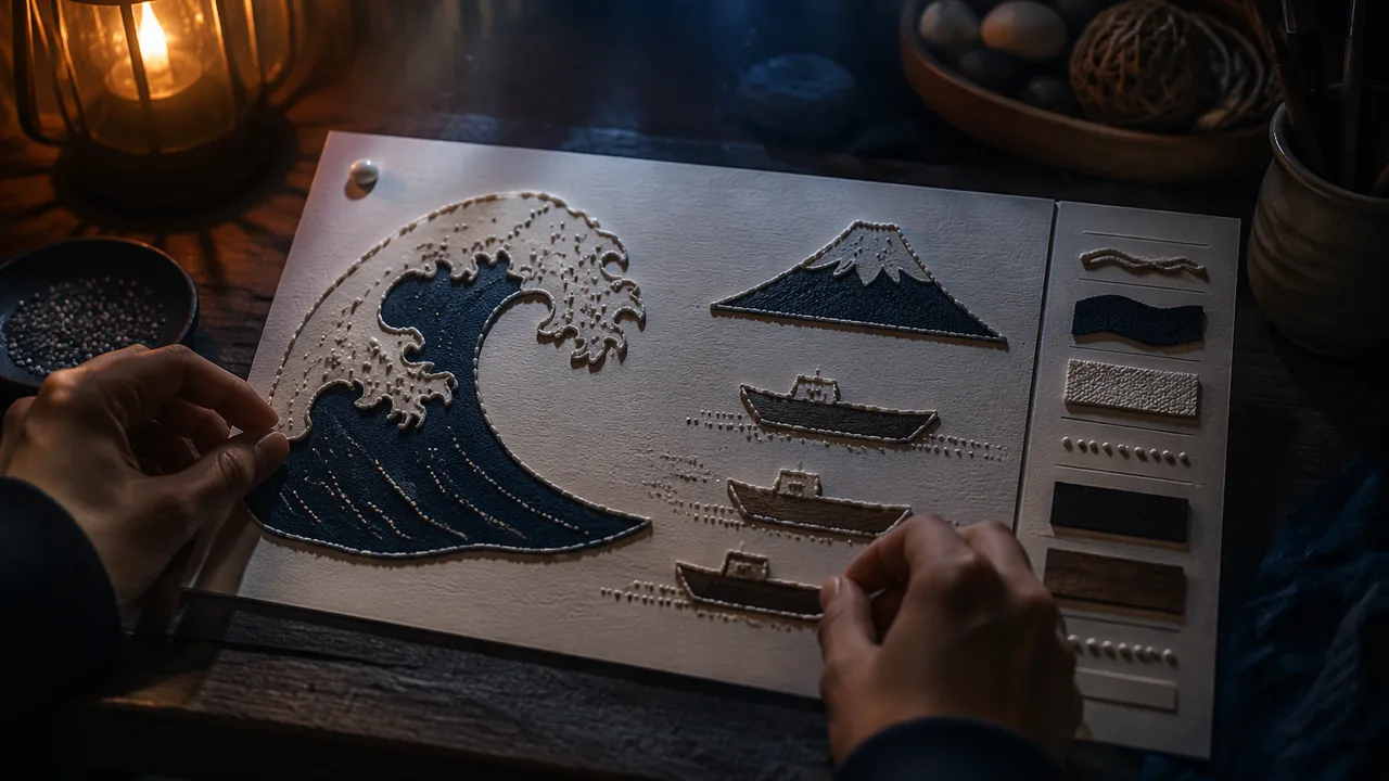
redesign an image as a collage tactile graphic with raised outlines, distinct textures, clear spacing and a key, following tactile-graphics principles.
Instruction
A collage tactile graphic is made by hand from card, string, glue lines and textured materials. Vision specialists in schools make them this way every day, because they are cheap, quick and durable. You will make one from a museum print or an AI image, following five principles.
1. Decide the purpose. Write one sentence: “A reader should learn that…”. For the Great Wave it might be: “a giant wave is about to fall on three small boats, with a small mountain far behind.” Everything that does not serve that sentence comes out.
2. Simplify and flatten. Remove perspective and overlapping where you can. Show objects in their most recognizable outline — a boat from the side, not from an angle. Separate shapes that touch in the original by a small gap, so a finger can find each edge. Keep the number of elements small; five to eight is plenty for a first graphic.
3. Use three kinds of tactile symbol. Lines (glue lines, string, puffy fabric paint) show edges and paths. Areas (textured papers, sandpaper, felt, foam sheet) fill shapes. Points (a bead, a bump of glue, a punched dot) mark small things. Make lines of different types clearly different — a smooth string and a dotted glue line, not two strings of similar thickness.
4. Space and texture. Leave clear space between separate lines and textures. Use only a few textures and make sure neighboring ones are strongly different (you tested this in Unit 2). Keep the most important shape the most distinctive.
5. Key and orientation. Put a key in the same place on every graphic (top or bottom), with each symbol and its large-print label. Mark the top edge — clip a corner or place a raised dot at the top left — so the reader holds it the right way. Add a title in large print; if a qualified braille transcriber can provide braille labels, attach them. Never invent braille by copying dot patterns you have not checked.
Materials science. PVA glue lines dry flat; for a raised line, use thick glue from the bottle nozzle in one steady pass and let it dry overnight, or use puffy fabric paint, or glue down string. Hot glue makes a high, hard line but can have sharp tails; trim them. Every material must be safe to touch: nothing sharp, loose or crumbly.
The Great Wave as a test. Hokusai’s print is visually rich and tactually difficult: the wave’s claw-like foam, the tiny Fuji, the boats hidden in the trough. Designing its tactile version forces every decision above. If you work from an AI image instead, record its label and apply the same five principles.
📖 Read for this lesson
The reading opens over the lesson; close it to come back to exactly where you were. The checks below draw on it.
Studio: The collage tactile graphic
Question. How do you redesign a visual image so that a reader using touch can find its main parts and understand what it shows?
Materials
- Heavy card or mat board about 22 × 28 cm
- PVA glue in a nozzle bottle and puffy fabric paint (optional)
- Cotton string or yarn of two different thicknesses
- Textured materials from the texture library: sandpaper, felt, corrugated card, foam sheet, burlap
- Scissors, a pencil, tracing paper and a printout of the source image
- Large-print labels (at least 24-point bold) and, if available, braille labels transcribed by a qualified person
- Scissors: cut away from your body; a craft knife is used only by an adult, or with an adult beside you, on a cutting mat.
- A low-temperature glue gun is used only with an adult present; trim sharp glue tails so the finished graphic is safe to touch.
- Check the finished graphic for anything sharp, loose or crumbly before anyone reads it by touch.
- Wash hands after using sandpaper and glue.
Procedure
- Write the one-sentence purpose for your graphic from the source image (the Great Wave or a labeled AI image).
- Trace the source, then redraw it simplified: five to eight elements, perspective removed, touching shapes separated by gaps.
- Assign a tactile symbol (line, area or point) to each element, and plan the key and orientation mark.
- Build from the base up: glue area textures first, then raised lines, then point symbols; let raised glue lines dry overnight.
- Add the key, the orientation mark and large-print (and, if available, braille) labels.
- Self-test with eyes closed: time how long it takes to find each element using the key, and fix anything you cannot find.
Data
| Element | Symbol type | Material | Found in self-test? (yes / slowly / no) | Fix |
|---|---|---|---|---|
| 1 | ||||
| 2 | ||||
| … |
Analysis
- Which element was hardest to find by touch, and which of the five principles would fix it?
- What did you have to leave out of the source image, and does the graphic still meet its purpose sentence?
- A self-test by someone who can see the graphic is not a real user test. What could a reader who is blind notice that you could not?
If you cannot do this studio in person: At home, use cereal-box card, PVA glue, string, cotton wool, aluminum foil, sandpaper and fabric scraps. Photograph each stage; a family member can do the self-test with eyes closed.
Formative check
Work through these before moving on. They are not graded — they tell you whether the standard below has landed yet.
In the Great Wave, a boat overlaps the wave. In a tactile graphic you should:
Line symbol
Tap to revealRaised line for an edge or path: string, glue line, puffy paint.
Area symbol
Tap to revealTexture filling a shape: sandpaper, felt, foam.
Point symbol
Tap to revealA single raised mark: bead, glue bump, punched dot.
Key
Tap to revealSamples of each symbol with labels, always in the same place.
Orientation mark
Tap to revealClipped corner or raised dot showing the top.
Upload a photo of your tactile graphic, your purpose sentence and your self-test table. Explain two design decisions using the five principles.
How confident are you that you can redesign an image as a tactile graphic using the five principles?
A Collage Tactile Graphic: The Great Wave Record, Standard Measurements and a Worked Design
SLS original worked design (illustrative); BANA Guidelines and Standards for Tactile Graphics; Art Institute of Chicago API, retrieved 26 Sept 2026 · SLS original, with CC0 museum metadata and factual measurements from BANA guidelines (no text reproduced)
Why this reading. The lab asks you to redesign an image as a collage tactile graphic with raised outlines, distinct textures, spacing and a key. If you choose Hokusai’s Great Wave, the record and a worked design are here (SLS original, illustrative), with dimensions drawn from the Braille Authority of North America’s Guidelines and Standards for Tactile Graphics (2010; 2022 edition free at brailleauthority.org). Measurements are facts from that standard; none of its text is reproduced.
The image
Katsushika Hokusai, Under the Wave off Kanagawa (The Great Wave), 1830/33, color woodblock print, oban, 25.4 × 37.6 cm, Art Institute of Chicago, accession 1925.3245, public domain (record retrieved 26 September 2026). A great wave curls over from the left with a crest of clawlike foam; small boats sit low in the troughs; a small Mount Fuji shows far off under the crest. Your own AI image is equally valid, with its label.
Numbers to design to (BANA)
- An area must be at least 1/4 square inch (about 1.6 square centimeters); treat a 1.5 × 1.5 cm patch as your practical minimum.
- Primary lines at least 1/2 inch (1.25 cm) long.
- Point symbols that must be told apart: at least 1/4 inch (6 mm) across, and at least 1/8 inch (3 mm) from any other component.
- Labels 1/8 to 1/4 inch (3 to 6 mm) from the thing they name; otherwise use a lead line of about 3/4 inch (2 cm).
- A key sample for an area texture: 1/2 inch high and 1 inch wide (1.25 × 2.5 cm).
- Clutter, meaning parts too close or too alike, is fixed by blank space between them.
Worked design (illustrative)
Purpose: “A reader should learn that a giant wave is about to fall on three small boats, with a small mountain far behind.” Sheet: 22 × 28 cm card, used in landscape (28 wide, 22 tall), with the top left corner clipped to mark the top. Positions are measured from the top-left corner, in cm.
| Element | Symbol type | Material | Position and size |
|---|---|---|---|
| Wave outline (the big curve) | Line | Thick glue line, dried overnight | From (1, 15) up to (8, 3) and over to (17, 9); longer than 1.25 cm at every part |
| Wave body | Area | Corrugated card, ribs following the curve | Inside the outline |
| Foam | Point symbols | Seven small beads, 6 mm across, 3 mm apart | Along the crest |
| Three boats | Area | Card shapes 2.5 × 1 cm, glued with a 3 mm gap around each | (3, 18), (12, 17), (21, 16) |
| Mount Fuji | Area | Felt triangle, 2.5 cm tall | (20, 11) |
| Sea | Area | Fine sandpaper | Bottom strip below y = 19, a texture different from the wave body |
| Sky | None | Blank card | Left empty on purpose |
Key, at the bottom left, same place on every graphic: five samples (wave body, boat, mountain, sea, foam bead), each 1.25 × 2.5 cm, each with a large-print label 3 mm from it; a title in large print top center. If a qualified transcriber can supply braille, place it; do not invent it.
Self-test table (fill in)
| Check | Pass? |
|---|---|
| Every pair of neighboring textures differs by feel with eyes closed | |
| Every symbol at least 6 mm across; gaps at least 3 mm | |
| Overlaps removed or separated | |
| Between five and eight elements | |
| Key present and in the standard place |
Sources: BANA, Guidelines and Standards for Tactile Graphics (brailleauthority.org); Art Institute of Chicago, The Great Wave, 1925.3245 (artic.edu)