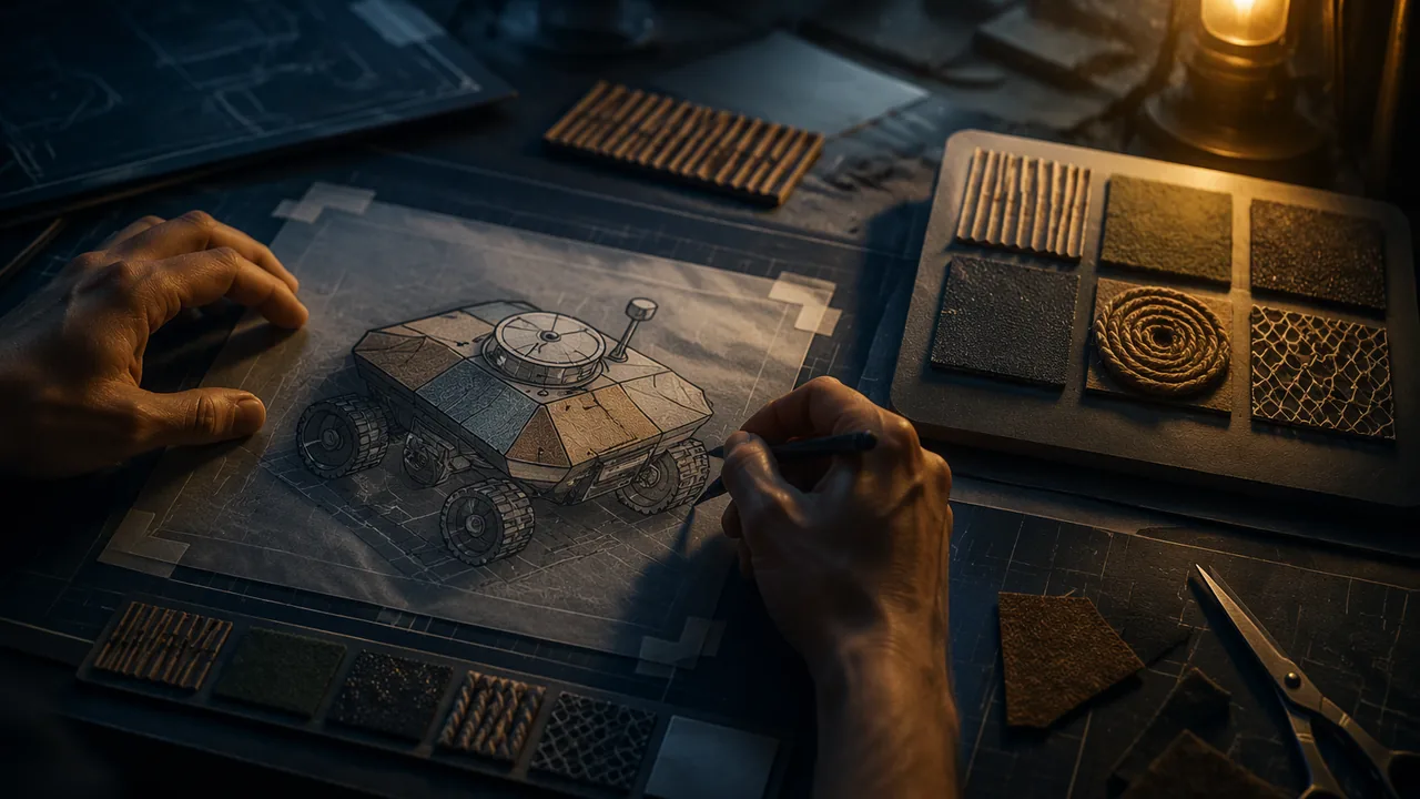
divide an AI-generated image into regions and assign each a real texture from my library, using contrast and emphasis so the most important region is the easiest to find by touch.
Instruction
In an AI image, every surface is implied: the sky looks soft, the rock looks rough, the water looks glassy, and all of it is equally flat. Your panel will give those surfaces real bodies. This workshop turns an image into a plan you can build.
Step 1: regions. Trace the main shapes of your chosen image onto tracing paper or a printout. Aim for five to seven regions. More than that, and a hand cannot keep track; fewer, and the panel feels empty. Merge small areas that belong together.
Step 2: assign textures. For each region, choose a swatch from your library. There are two ways to decide. Analogy: choose a texture like the thing shown (bark for a tree, sandpaper for a beach). Expression: choose a texture for the feeling you want (something sharp for a threatening sky, even if skies are not sharp). The strongest panels use both, on purpose. Write your reason beside each region.
Step 3: contrast and emphasis. Emphasis — making one part dominant — is harder by touch than by sight, because the hand has no overview. Make the most important region the most different from everything around it: highest, or most sharply textured, or the only smooth area in a rough field. Neighboring regions must be clearly different from each other; if two neighbors feel alike, the boundary disappears. A raised line (string glued along the edge) can separate regions that must stay similar.
Step 4: the texture key. A key is a strip along the edge of the panel with a small sample of each texture and, beside it, its label in large print (and in braille only if a qualified braille transcriber can provide it). A reader touches the key first, then finds each texture in the panel. Keys are standard in tactile graphics for blind readers, and they are useful for everyone.
Step 5: materials and build order. List the materials for each region. Plan the build from the base up: glue flat materials (fabric, paper) first, then relief materials (clay, cord), and finish with anything delicate. Heavy clay on thin card will warp, so use mat board or cardboard with a backing layer, or press clay onto the board and let it dry flat under a weight.
Self-critique. Before you build, run a quick check against the criteria from Lesson 1.3: Can I name the main region? Are all neighbors distinct? Does each texture have a reason? Revise the map before a single drop of glue is used; changes are cheap now and expensive later.
📖 Read for this lesson
The reading opens over the lesson; close it to come back to exactly where you were. The checks below draw on it.
Formative check
Work through these before moving on. They are not graded — they tell you whether the standard below has landed yet.
How can you make the most important region easiest to find by touch?
Choosing a sharp texture for a sky can be a valid decision even though real skies are not sharp.
Upload your texture map: the image label, five to seven regions, the swatch number and reason for each (analogy or expression), your emphasis plan, your key design and your build order. Then list one change you made after self-critique.
How confident are you that you can plan a texture translation with clear contrast and emphasis?
A Worked Texture Map: Regions, Swatches, Key Dimensions and Build Order
SLS original worked map (illustrative); BANA Guidelines and Standards for Tactile Graphics, 2022 edition, retrieved 26 Sept 2026 · SLS original (illustrative worked example); factual measurements from BANA guidelines, no text reproduced
Why this reading. The workshop asks for a texture map of an AI image: five to seven regions, a swatch and a reason for each, an emphasis plan, a key design and a build order. Your image comes from the provided set; if you have not chosen, this reading carries a full worked map of one of them, with the measurements a key needs. The worked map and specifications are SLS original and illustrative; the image is described in Lesson 1.1.
Worked map: A Recent Entrance to Paradise
Generated by Steven Thaler’s Creativity Machine; reproduced in the U.S. Copyright Office Review Board letter of 14 February 2022 (public domain). As described in Lesson 1.1: railway tracks run straight away from the viewer through a low stone arch smothered in leaves and purple blossom; a second, smaller arch shows through the first, and past it a green glow; the picture is mottled and grainy, dark violet at the left to warm pink at the right. Test sentence: “a railway leads through a flowering arch toward a glowing green light.”
| Region | Swatch | Analogy or expression | Reason |
|---|---|---|---|
| 1. Outer stone arch | T5 coarse sandpaper | Analogy | Rough like old stone. |
| 2. Leaves and blossom on the arch | T8 bubble wrap | Analogy | Small round bumps read as blossom clusters. |
| 3. Railway tracks | T7 corrugated card, ribs running along the track | Analogy | Directional: fingers glide along the rails. |
| 4. Ground either side | T11 burlap | Expression | Coarse weave suggests the grainy mottling of the source. |
| 5. Inner, smaller arch | T2 cord impressed in clay | Analogy | Distinct from the outer arch: smaller and finer. |
| 6. Green glow | T1 smooth clay, glazed with PVA | Expression | The only smooth region, so it is found by contrast; smooth as light. |
Emphasis plan: the glow is the main region. It is the only smooth area in a field of rough ones, and it is the deepest, set 3 mm below the tracks. Neighbor check: arch (T5) touches ground (T11): both rough, so a raised string line 2 mm high separates them.
Key: dimensions and layout
The published tactile-graphics standard, Guidelines and Standards for Tactile Graphics from the Braille Authority of North America (BANA; 2010 edition, updated 2022; free to download from brailleauthority.org), gives measurements you can borrow. Its area texture samples for a key are 1/2 inch (1.25 cm) high and 1 inch (2.5 cm) wide; an area must be at least 1/4 square inch to be read; symbols and labels should be at least 1/8 inch (3 mm) apart; and clutter, meaning components too close or too alike, is fixed by adding blank space between textures. For a panel of 20 × 25 cm, cut a 3.5 × 25 cm strip along the left edge for the key. Each of the six samples is 1.25 × 2.5 cm, spaced 1 cm apart, made from the same material as its region, with a large-print label to its right and, if a transcriber is available, braille below it. Put the key on the left so a reader’s hand meets it first.
Materials and build order for the worked map
- Base: 3 mm mat board or double-thickness corrugated card, 20 × 25 cm, with a backing sheet glued to stop warping.
- Flat materials first with PVA glue: burlap, sandpaper, corrugated card. Press flat under a book, 30 minutes each.
- Relief materials next: clay for the inner arch, pressed onto the board and dried flat under a weight for 24–48 hours; bubble wrap glued bubbles up.
- Delicate parts last: string separator lines; the glazed smooth glow.
Self-critique before building: can I name the main region by touch? Are all six neighbors distinct? Does each texture have a reason? Change the map now.
Sources: BANA, Guidelines and Standards for Tactile Graphics (2022 edition) (brailleauthority.org); U.S. Copyright Office Review Board letter on A Recent Entrance to Paradise, 14 Feb 2022 (copyright.gov)