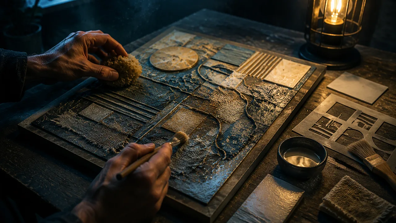
plan a medium study that combines a base technique with at least two surface treatments — glazing, dry brushing, stencilling, collage inclusion or sealing — in a deliberate layering order.
Instruction
Most finished tactile works are built in layers: a structure, a texture, and one or more surface treatments that change how the texture looks and feels. This workshop teaches five treatments and the order that makes them work.
1. Glazing. A thin, transparent layer of color (acrylic paint thinned with glazing medium or water) brushed over a dry textured surface. It pools in the low areas and thins on the high ones, so the texture becomes more visible without changing how it feels. Glazing helps low-vision viewers, who may read a work partly by sight and partly by touch.
2. Dry brushing. The opposite of glazing: a brush almost free of paint dragged lightly across the surface so color catches only the high points. Ridges light up; hollows stay dark.
3. Stencilling. Cut a shape from card, lay it on the surface and apply paste or paint through it with a sponge or knife. With modeling paste, a stencil makes a crisp raised shape — a quick, repeatable way to create a symbol or pattern at an exact size.
4. Collage inclusion. Pressing fabric, string, paper or found flat objects into wet paste or glue so they become part of the surface. Inclusions give sharp contrasts: a line of string in a field of sand-paint is instantly findable by touch.
5. Sealing. A final coat of acrylic matte medium or diluted PVA locks loose particles and protects surfaces from hand oils. Sealing makes a surface smoother and slightly glossier, so test it on a sample first: sometimes it dulls the texture you worked for.
Layering order. Work from structure to surface: base board, then structural relief (clay, card layers), then texture (paste, inclusions), then color (glaze first, dry brush last), then seal. Paint before texture and the texture buries the paint; seal before dry brushing and the dry brush will not grip.
Your medium rationale. Using your Lesson 3.3 matrix and Lesson 3.2 wear tests, write 150-200 words naming your chosen medium, the two media you compared, the criteria that decided it, and the risks you will manage. Then write the layer plan as a numbered list and make a 10 × 10 cm sample that goes through the full sequence. The sample is your rehearsal; if a step fails, you want it to fail here.
Choosing the AI image. The course asks for a work inspired by an AI-generated image of your choice. Choose from the course image set or by your Lesson 1.1 route, and record its label. “Inspired by” means you may depart from it much further than in Unit 1; say how far, and why.
📖 Read for this lesson
The reading opens over the lesson; close it to come back to exactly where you were. The checks below draw on it.
Formative check
Work through these before moving on. They are not graded — they tell you whether the standard below has landed yet.
Which layering order is correct?
You brush a thin transparent glaze over a dry, ridged impasto surface. What happens?
Upload your medium rationale (150-200 words), your numbered layer plan, the AI image label and a photo of your 10 × 10 cm sample. Note one step that did not go as planned in the sample and what you will change.
How confident are you that you can plan a mixed-media work with surface treatments in a working order?
Layering Surfaces: Amounts, Order, a Worked Layer Plan and a Sample Rationale
SLS original technique sheet (starting points to be tested) · SLS original
Why this reading. The workshop asks for a medium rationale, a numbered layer plan and a 10 × 10 cm sample that runs the whole layering sequence. This is the technique sheet: amounts, thicknesses, drying times, a worked layer plan and a sample rationale. All numbers are SLS studio starting points (SLS original); every one must be tested on your sample before you rely on it, and manufacturer directions on your products override them.
Five treatments, with amounts
| Treatment | Mix or method | Thickness | Ready when |
|---|---|---|---|
| Structure (clay or card layers) | Card layers glued with PVA, or clay 3–5 mm high | 3–5 mm per level | Clay: dry, 24–48 h. Card: glue set, 30 min pressed. |
| Texture (modeling paste) | Paste straight from the tub, or 1 part paint to 1 part paste | about 2 mm; never more than 5 mm at once | Dry to the touch and cool, usually 4–6 h |
| Stencil | Card stencil 1–2 mm thick; spread paste through it with a knife, then lift straight up | 2 mm | as paste |
| Collage inclusion | PVA about 1 mm thick; press string, fabric or paper into it | — | 1–2 h, overnight to be safe |
| Glaze | Start at 1 part acrylic paint to 4 parts glazing medium (or water for a weaker wash) | transparent | 30–60 min |
| Dry brush | Load the brush, blot on paper towel until it leaves only a faint mark, drag lightly over the high points | almost none | 10 min |
| Seal | Matte medium, or 1 part PVA to 1 part water; one thin coat | thin | 24 h before handling |
Order, and why
- Base board (3 mm mat board or double corrugated card, 10 × 10 cm for the sample).
- Structural relief.
- Texture (paste, inclusions).
- Color: glaze first, dry brush last.
- Seal.
Test the order the wrong way once, on scrap: paint before paste and the paste buries the color; seal before dry brushing and the brush slides off. Record what happened in one line.
Worked layer plan (illustrative): crumbling staircase in mist
- Base: 10 × 10 cm mat board. (Day 1)
- Structure: five stepped strips of 3 mm card, each 1.5 cm wide, glued in a diagonal, forming steps 3, 6, 9, 12 and 15 mm high. (Day 1, 30 min pressed)
- Texture: paste over the steps, 2 mm, combed with a fork; upper right corner left flat for the mist. (Day 1, overnight)
- Inclusion: one line of string pressed into PVA along the top step edge. (Day 2, 1 h)
- Glaze: gray-brown glaze (1 part paint, 4 parts medium) over the steps only; the mist stays white. (Day 2, 1 h)
- Dry brush: pale gray, on the tops of the combed ridges. (Day 2, 10 min)
- Seal: one thin coat of matte medium, edges included. (Day 2, 24 h before handling)
Sample rationale (about 120 words, illustrative): I chose impasto paste over air-dry clay for a museum touch-table piece because my wear test showed paste losing almost nothing after twenty rubs while unsealed clay shed powder and chipped. I compared them against readability, where clay is stronger, and expressive fit, where clay can literally crumble. Durability won because hundreds of hands will touch it. The risks I will manage are that paste is less crisp at an edge, so I will build the steps in card first, and that the seal may dull the texture, so I tested it on a scrap. The mist stays smooth and low so the steps read as the main form.
Sources: Art & Creative Materials Institute (acmiart.org)