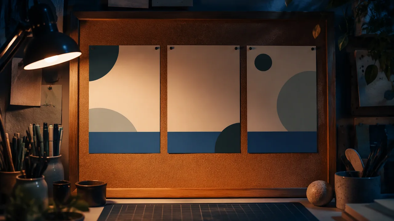
plan and produce a poster campaign for a theater or dance production or a community event with a clear communication strategy, visual hierarchy and legible typography.
Instruction
The approved course record asks students to make effective advertising layouts for a theater production or a leadership effort, showing effective use of color, dominant and subordinate elements, typography and production skills, through a process of communication strategy, initial layout, revision and final product. It also asks students to design a campaign for a theater or dance production that creates images representing characters and major events. This workshop does that for an event you choose: a community theater or dance production near you, a library or community-center event, or a production of a classic play that you imagine staging. If you design for a real organization, it is a practice piece unless the organization asks for it; display or post any version outside your home only with a parent’s permission.
1. The communication strategy. Before any drawing, answer in writing: Who is the audience (teenagers, families, the neighborhood)? What is the one message? What do you want them to do (come on Friday, buy a ticket, sign up)? What is the tone (funny, eerie, urgent, warm)? For a play, read the script or a reliable synopsis: which character or moment best captures the show without spoiling it?
2. Hierarchy. A poster is read in a planned order. Level one is the headline or image that stops a passer-by; it should be readable from about ten feet. Level two is the supporting text: what, when, where. Level three is the fine print: ticket details, credits. Size, weight, color contrast and position set the order. Lautrec’s La Goulue poster puts the dancer first and the venue name second; your poster should also make one element dominant and subordinate the rest.
3. Typography. Use no more than two typefaces: one with character for the headline, one plain and highly legible for information. Contrast them strongly in size or weight rather than using several similar sizes. Align text deliberately (left-aligned is easiest to read). Keep line lengths short. Letter-space capitals slightly. Test legibility by printing at full size (or tiling it on letter paper) and reading it from ten feet away. Use fonts you have the right to use: fonts released under the SIL Open Font License, which includes many Google Fonts, may be used in your design. Hand lettering is always yours.
4. Image. Create the image yourself: draw, paint, cut paper, or photograph family members or friends posing as characters, with their permission (and a parent’s permission for anyone under 18). Represent a character or a key event through a single strong visual idea, a silhouette, a prop, a gesture, rather than a crowded scene. Test it as a thumbnail the size of a stamp: if it reads there, it will read on a wall.
5. Color. Limit the palette to two or three colors plus black and white. Choose contrast for legibility (dark text on light ground or the reverse) and hue for mood.
6. The campaign. A campaign is more than one poster. Design two companion pieces that share the poster’s image, colors and type: a square social-media graphic and a program cover, ticket or flyer. Consistency across pieces builds recognition.
Tools. Work by hand (cut paper, markers, paint) and scan, or build digitally in Inkscape or Krita (free). Keep layers and the original files.
A worked example. For a community theater production of Macbeth, one student chose a single image: a dagger drawn in white chalk on black paper, its shadow forming a crown. The headline, MACBETH, was hand-lettered in tall, narrow capitals; the supporting text was set small in a plain sans-serif at the bottom. Red appeared only in one drop on the blade. On a five-second test, her grandfather, standing ten feet away, could not read the date; she enlarged it and moved it beside the title.
📖 Read for this lesson
The reading opens over the lesson; close it to come back to exactly where you were. The checks below draw on it.
Formative check
Work through these before moving on. They are not graded — they tell you whether the standard below has landed yet.
Your poster uses five typefaces in similar sizes. What is the most effective revision?
Fonts released under the SIL Open Font License may be used in a student’s poster design.
Write your communication strategy in four lines: audience, message, action, tone. Then describe the one visual idea your poster will use.
How confident are you that you can plan a poster campaign with a strategy, a clear hierarchy and legible typography?
Practice
Work these on paper or in your notebook, then open Check your answer. Aim for all of Fluency and Application; try at least one Challenge.
Printable version: this unit’s practice workbook (PDF)
Fluency
Build speed and accuracy with the core skill.
- What are the four parts of a communication strategy?
Check your answer
Answer: Audience, message, desired action, tone.Write it before any drawing. - Describe the three levels of a poster’s visual hierarchy.
Check your answer
Answer: Level one: the headline or image that stops a passer-by, readable from about ten feet. Level two: supporting text (what, when, where). Level three: fine print (ticket details, credits). Size, weight, color contrast and position set the order.One element dominates; the rest are subordinate. - Give four of the workshop’s typography rules.
Check your answer
Answer: Any four: no more than two typefaces (one with character for the headline, one plain for information); strong contrast of size or weight, not several similar sizes; deliberate alignment (left is easiest to read); short line lengths; slightly letter-spaced capitals; test at full size from ten feet; use fonts you have the right to use (for example SIL Open Font License); hand lettering is always yours.Too many similar typefaces flatten the hierarchy.
Application
Use the skill in context. Show your reasoning.
- The technique sheet’s rule is at least 1 inch of cap height per 10 feet of viewing distance. What cap height does a headline need to be read from 10 feet? From 25 feet? If cap height is about 0.7 of the type size, about what point size gives a 1-inch cap height (72 points = 1 inch)?
Check your answer
Answer: 10 ft: at least 1 inch; 25 ft: at least 2.5 inches. About 103 points for a 1-inch cap height.25 / 10 x 1 = 2.5 in. Type size = 1 / 0.7 = 1.43 in.; 1.43 x 72 = 103 pt. (The sheet’s 1.5-in. headline is about 154 pt: 1.5 / 0.7 x 72 = 154.) - The main poster is 11 x 17 inches with a 0.75-inch margin all round. What is the live area? If the file is 3300 x 5100 pixels, what resolution is that in pixels per inch?
Check your answer
Answer: Live area 9.5 x 15.5 inches. Resolution 300 pixels per inch.11 – 2(0.75) = 9.5; 17 – 2(0.75) = 15.5. 3300 / 11 = 300 and 5100 / 17 = 300. - In the Macbeth example, the grandfather could not read the date from ten feet. Diagnose the problem with the hierarchy and describe the fix.
Check your answer
Answer: The date was in the fine print (level three), too small to read at ten feet. The fix promoted the date to level two, enlarging it and moving it beside the title, so it read on a second five-second test.The test reveals whether the planned reading order works for the real audience. - Write a four-line communication strategy for a poster for a library story-time event (audience, message, action, tone), and describe one single strong visual idea for it.
Check your answer
Answer: Model. Audience: families with young children in the neighborhood. Message: stories come alive at the library on Saturday mornings. Action: come on Saturday at 10 a.m. Tone: warm and playful. Visual idea: one open book whose pages fold up into a paper dragon, in two colors plus black and white.A strong answer fills all four lines and uses one visual idea (a silhouette, prop or gesture), not a crowded scene; any images of real people need permission.
Review
Keep earlier skills sharp.
- Review (Lesson 3.3): which features of Lautrec’s La Goulue poster does the workshop ask you to borrow for your own poster?
Check your answer
Answer: One dominant element with the rest subordinated (the dancer first, the venue name second), and simplification so the image reads at a glance: a limited palette and a single strong visual idea, testable as a stamp-sized thumbnail.A poster must work in seconds, from a distance.
Poster Campaign Technique Sheet: A Filled-In Strategy, Layout and Type Sizes, Contrast Numbers, Campaign Formats
SLS original technique sheet; contrast ratios calculated by SLS with the WCAG relative-luminance formula · SLS original
Why this reading. The workshop tells you to make one element dominant, limit typefaces, test legibility and build a campaign. To do that you need sizes, layout coordinates, color-contrast numbers and file specifications, plus a filled-in strategy to model yours on. This is that technique sheet. It is an SLS original; the example is constructed, and no one else’s poster is copied. For published posters to compare, see the reading “How Posters Persuade” (Lautrec, Art Institute of Chicago 1954.1193; WPA posters at the Library of Congress).
1. Communication strategy, filled in (SLS original; constructed)
| Question | Example answer for a community theater production of Macbeth |
|---|---|
| Audience | Teenagers and families in our town; will see it on a library or coffee-shop bulletin board from about 10 feet and on a phone |
| One message | A tragedy about ambition is on the community stage, and it is dark |
| Action | Come Friday, 7 p.m., to the community theater; tickets at the door |
| Tone | Eerie and urgent; not funny |
| Single visual idea | A white chalk dagger whose shadow forms a crown |
2. Poster size and layout in numbers
Use 11 × 17 in. (portrait) with a 0.75-in. margin all round, so the live area is 9.5 × 15.5 in. Divide the height into three bands.
| Level | Band (measured from top of live area) | Content | Size of capital letters (cap height) |
|---|---|---|---|
| 1 | 0 to 9.3 in. (60 percent) for the image; headline overprints the top 2 in. | Image and headline (MACBETH) | 1.5 in. (about 154 pt type, since cap height is about 0.7 of type size for many typefaces; check yours) |
| 2 | 9.3 to 13.9 in. | What, when, where: FRIDAY 7 P.M. / COMMUNITY THEATER | 0.5 in. (about 51 pt) |
| 3 | 13.9 to 15.5 in. | Tickets, credits, web address | 0.15 in. (about 15 pt): readable up close, not from ten feet |
The rule for this workshop: the top level’s cap height in inches must be at least 1 inch for every 10 feet of viewing distance. That is the course guide, not a standard: test it by printing at full size and standing 10 feet back.
3. Color contrast: check the numbers
Contrast ratio compares the brightness of two colors, from 1:1 (no contrast) to 21:1 (black on white). Aim for at least 4.5:1 for anything that must be read at a distance. Calculated for these pairs:
| Text on background | Contrast ratio | Verdict |
|---|---|---|
| #111111 on cream #F4EFE6 | 16.5 : 1 | Excellent |
| Navy #1B2A41 on cream #F4EFE6 | 12.6 : 1 | Excellent |
| Gold #F2C94C on navy #1B2A41 | 9.1 : 1 | Strong |
| Red #B3261E on cream #F4EFE6 | 5.7 : 1 | Good for headlines |
| White on red #B3261E | 6.5 : 1 | Good |
| Gray #888888 on white | 3.5 : 1 | Too weak for small text |
| Gold #F2C94C on cream #F4EFE6 | 1.4 : 1 | Unreadable |
Limit the palette to two or three colors plus black and white. One accent (the example uses one red drop) draws the eye to one place.
4. Typefaces
Two only: a headline face with character (hand lettering counts) and one plain face for information. Align left. Keep lines to about 30 to 40 characters. Use a font whose license permits your use; the SIL Open Font License covers many Google Fonts. Keep the license page or a note of it with your files.
5. Thumbnails
Draw six thumbnails in boxes 2 in. wide × 3.1 in. tall (the 11:17 ratio). Vary only one thing at a time: image position, headline position, or crop. Pick one; then draw the image at stamp size (about 1 × 1.5 in.). If you can tell what it is at that size, it works on a wall.
6. The campaign: sizes and what stays the same
| Piece | Size | File size at 300 dpi (print) or screen size |
|---|---|---|
| Main poster | 11 × 17 in. | 3300 × 5100 px |
| Program cover | 5.5 × 8.5 in. | 1650 × 2550 px |
| Square social graphic | 1080 × 1080 px | Screen only |
Keep constant across all three: the image (recropped for each shape), the palette, the two typefaces and the position of the date. Change: the crop and the amount of text. In the example the social square crops to the dagger and its crown-shadow only, with MACBETH set beneath and the date in gold.
7. Two tests and a checklist
- Five-second test: show the poster to a family member or other adult for five seconds, then hide it (alone: tape it up, walk away, turn back for five seconds, and write what you saw). Ask: what is it for, and when? If they miss either, the top two levels are too weak.
- Squint test: the two darkest, largest shapes you can still see are your real hierarchy.
- Checklist: one dominant element; two typefaces; date readable at 10 feet; contrast at least 4.5 : 1; image made by you or with permission; originals saved in layers; files exported at the sizes above; a parent’s permission before the poster is displayed or posted outside your home.
8. Worked critique (SLS original)
Two family members at 10 feet could read MACBETH but not the date. Cause: the date was level three (0.15 in.). Change: promote FRIDAY 7 P.M. to level two (0.5 in. cap height) and place it beside the title in gold on navy (9.1 : 1). Result: both named the date on a second five-second test.