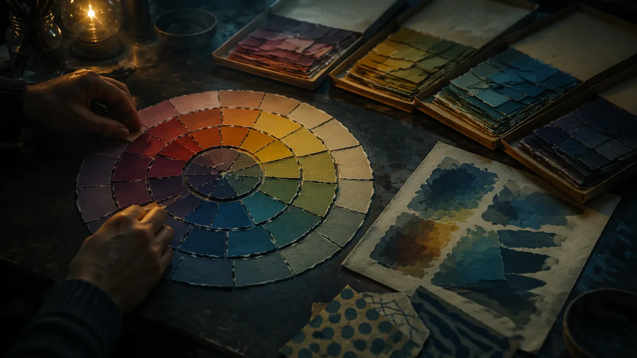
build a paper color wheel and a working paper palette sorted by hue, value and texture, and test how paper pieces behave as brushstrokes over a painted wash.
Instruction
The record’s Painting with Paper project asks students to develop a paper color wheel as a skill builder and then a working paper palette from a variety of paper sources. A painter mixes colors on a palette; you will collect and sort them. The discipline is the same: you need every hue in a range of values, organized so you can find what you need.
Sources. Magazines, catalogs, junk mail, paint-sample cards, wrapping paper, tissue, old maps, and papers you painted or printed in semester A. Avoid glossy magazine pages with strong printed text in areas you will use, unless you want the text to show. Sort as you collect: throw away anything with offensive or personal content.
The paper color wheel. Draw a twelve-part wheel: three primaries (red, yellow, blue), three secondaries (orange, green, violet) and six tertiaries between them (red-orange, yellow-orange, yellow-green, blue-green, blue-violet, red-violet). Fill each segment with torn paper of that hue. This is harder than it sounds. Most printed colors are not pure hues: a “red” page may lean orange or violet. Place each piece where it truly belongs, not where you wish it did. Then add a ring outside the wheel for tints (lighter) and inside for shades (darker) of each hue.
Value is the hard part. Photograph your wheel and convert it to grayscale. You will probably find that your yellows are all light and your blues and violets all dark. A landscape needs a light blue sky and a dark yellow-green shadow, so you must hunt for dark yellows (ochres, olives) and light blues (pale sky tints).
The working palette. Sort your collection into envelopes or folders by hue family, and within each by value (light, middle, dark). Add a separate group for textures: pieces with patterns, printed dots, grain or text that can suggest foliage, water, bricks or grass. A good palette for a landscape has at least five values of green, five of blue and several earth colors.
The wash. The record’s process starts by laying down a base wash of paint on the substrate before paper is applied. The wash sets the overall color temperature and fills gaps between pieces, so small gaps read as part of the image instead of white holes. A warm wash (thin burnt sienna or orange) under a landscape makes greens and blues vibrate; a cool wash (thin blue-gray) gives a calmer, misty feel.
Paper as brushstroke. Here is the idea at the heart of the project: each piece of paper should act like a brushstroke. Its size, shape, edge and direction describe the form beneath. Small, torn, directional pieces can build foliage the way Van Gogh’s short strokes do in The Poet’s Garden. Large, smooth pieces can be sky or still water. Torn edges soften; cut edges sharpen. Overlap pieces like shingles for depth.
A worked example. For a strip of distant hills over a field: warm orange wash; hills from three pieces of pale blue-violet, torn along the top edge so the skyline is soft; a middle band of mid-value yellow-green cut into short horizontal strips; a foreground of dark green torn into small vertical pieces, overlapping, for grass. The value steps from light (far) to dark (near) do more to create depth than any detail. That is atmospheric perspective: distant things appear lighter, cooler and less detailed.
📖 Read for this lesson
The reading opens over the lesson; close it to come back to exactly where you were. The checks below draw on it.
Studio: Paper color wheel and working paper palette
Question. Can found and hand-painted papers be organized into a palette with a full range of hues and values, and can they be used like brushstrokes to create depth?
Materials
- Magazines, catalogs, paint-sample cards, tissue and wrapping paper, plus papers painted or printed in semester A
- Heavy paper or board for the color wheel; a small canvas board or heavy board strip for the test
- Acrylic paint in a warm and a cool color, a wide flat brush and water
- PVA glue or acrylic matte medium with a glue brush; scissors
- Labeled envelopes or folders for the palette; a phone camera for grayscale checks
- Use scissors on a cutting mat, cutting away from the body; use a craft knife only with an adult present, and cap the blade whenever it is set down.
- Check paper sources for staples and pins before tearing; remove them with a staple remover, not fingers.
- Rinse acrylic brushes into a bucket, not the sink, and let solids settle before disposal.
- Clear a workspace large enough to sort papers without crowding; keep floors free of scraps to prevent slipping.
Procedure
- Draw a twelve-segment color wheel and fill each segment with torn paper of the correct hue, checking each piece against its neighbors.
- Add an outer ring of tints and an inner ring of shades for each hue.
- Photograph the wheel, convert it to grayscale, and note hues missing a light or dark value; hunt for papers to fill the gaps.
- Sort your collection into labeled envelopes by hue family and, within each, by light, middle and dark value; add a texture envelope.
- Paint a small board with a thin warm wash and another with a cool wash; let them dry.
- On each board, build the same small landscape strip (far hills, middle field, near grass) with torn and cut pieces, stepping from light and cool in the distance to dark and warm in the foreground.
Data
| Hue family | Lightest value found | Darkest value found | Gap to fill |
|---|---|---|---|
| Yellow and yellow-green | |||
| Green and blue-green | |||
| Blue and blue-violet | |||
| Red, orange and earth colors |
Analysis
- Which hues were hardest to find in light and dark values, and what did the grayscale photo reveal that your eye missed?
- Compare the warm-wash and cool-wash strips. How did the wash change the mood and the sense of distance?
- Where did your paper pieces act like brushstrokes, and where did they look like pasted scraps? What made the difference?
If you cannot do this studio in person: Low-cost version: make a smaller six-hue wheel from magazines or food packaging, sort papers into labeled envelopes, and build the test strip on cardboard over a wash of any water-based paint or a colored paper ground. Photograph for submission.
Formative check
Work through these before moving on. They are not graded — they tell you whether the standard below has landed yet.
Your grayscale photo shows all your yellows are very light. Why is this a problem for a landscape?
In atmospheric perspective, distant hills appear lighter, cooler and less detailed than near ones.
Blue-green, red-orange and yellow-green are called colors.
How confident are you that you can build a paper palette with a range of hues and values and use paper pieces like brushstrokes?
Practice
Work these on paper or in your notebook, then open Check your answer. Aim for all of Fluency and Application; try at least one Challenge.
Printable version: this unit’s practice workbook (PDF)
Fluency
Build speed and accuracy with the core skill.
- List the three primaries, three secondaries and six tertiaries of the twelve-part wheel.
Check your answer
Answer: Primaries: red, yellow, blue. Secondaries: orange, green, violet. Tertiaries: red-orange, yellow-orange, yellow-green, blue-green, blue-violet, red-violet.A tertiary mixes a primary with a neighboring secondary. - Define atmospheric perspective and color temperature.
Check your answer
Answer: Atmospheric perspective: distant objects look lighter, cooler, less contrasting and less detailed. Color temperature: the warmth (reds, oranges, yellows) or coolness (blues, greens, violets) of a color.Glossary terms from the lab. - What does the base wash do in a paper painting? Contrast a warm wash with a cool one.
Check your answer
Answer: It sets the overall color temperature and fills gaps between pieces, so small gaps read as part of the image instead of white holes. A warm wash (thin burnt sienna or orange) makes greens and blues vibrate; a cool wash (thin blue-gray) gives a calmer, misty feel.The wash is laid on the substrate before any paper.
Application
Use the skill in context. Show your reasoning.
- The lab sheet’s wheel is an 8-inch circle in 12 equal segments. How many degrees is each segment? Which hue sits opposite yellow, opposite red and opposite blue?
Check your answer
Answer: 30 degrees each (360 / 12). Opposite (180 degrees apart): yellow and violet, red and green, blue and orange; these are complements.Each primary sits 120 degrees from the next (4 segments x 30). - Your grayscale photo shows every yellow piece is light and every blue piece dark. Why is this a problem for a landscape, and what papers must you hunt for?
Check your answer
Answer: A landscape needs a light blue sky and dark yellow-green shadows, so you need dark yellows (ochres, olives) and light blues (pale sky tints). Without them you cannot step values correctly from far to near.Most printed colors are not pure hues, and the eye misjudges their values; the grayscale photo reveals it. - Plan the test strip of far hills, a middle field and near grass: give the size, shape and edge of pieces for each band, following the worked example.
Check your answer
Answer: Far hills: three pieces of pale blue-violet, torn along the top edge so the skyline is soft. Middle field: mid-value yellow-green cut into short horizontal strips. Foreground grass: dark green torn into small vertical pieces, overlapping. All over a warm orange wash.The value steps from light (far) to dark (near) create depth more than any detail. - Explain the idea that each piece of paper should act like a brushstroke. Give two examples of how size, edge or direction describes a form.
Check your answer
Answer: Each piece’s size, shape, edge and direction describe the form beneath it, as a painter’s stroke would. Examples: small torn directional pieces build foliage like Van Gogh’s short strokes in The Poet’s Garden; large smooth pieces become sky or still water; torn edges soften, cut edges sharpen; pieces overlapped like shingles give depth.Any two correct examples from the lesson are acceptable.
Challenge
Stretch problems. Expect to think before you write.
- On the lab sheet’s 8-inch wheel, the hue ring runs from radius 2 to 3 inches. At the middle of that ring (radius 2.5 in.), how wide is one 30-degree segment? Show the arc-length arithmetic.
Check your answer
Answer: About 1.3 inches wide (and 1 inch deep), so cut each hue piece about 1.3 x 1 inch.Arc length = radius x angle in radians = 2.5 x 30 x π / 180 = 2.5 x 0.5236 = 1.31 inches. Depth = 3 – 2 = 1 inch.
Review
Keep earlier skills sharp.
- Review (Lesson 2.1): which of the unit’s landscapes uses a strong, unexpected color ground that you might imitate with a wash, and what mood does the lesson say it creates?
Check your answer
Answer: The Rajput Maru Ragini: a warrior and his camel at a green stream against an intensely yellow ground. The landscape is a mood, not a map.A wash similarly sets the overall temperature and mood of a paper painting.
Paper Palette Lab Sheet: Wheel Geometry, Value Targets, an Envelope Inventory and the Test Strip
SLS original lab reference sheet; all dimensions and values set or computed by SLS · SLS original
Why this reading. The lab has you build a paper color wheel, sort a palette by hue and value, and test two washes. This sheet gives the wheel’s dimensions, the value targets each hue family must reach, the envelope inventory and the dimensions of the test strip, so you know when each part is done.
1. The wheel, in numbers
Draw an 8-in.-diameter circle on heavy paper. Divide it into 12 segments of 30 degrees each (360 ÷ 12). Then draw circles at radii 1, 2, 3 and 4 in. from the center: the hub (radius 0 to 1 in.) stays empty; the shade ring is radius 1–2 in.; the hue ring is radius 2–3 in.; the tint ring is radius 3–4 in. At the middle of the hue ring (radius 2.5 in.) each segment is 2.5 × 30° × π ÷ 180 = about 1.3 in. wide and 1 in. deep, so cut each hue piece about 1.3 × 1 in.
| Position (clockwise from the top) | Hue | Type |
|---|---|---|
| 0° | Yellow | Primary |
| 30° | Yellow-orange | Tertiary |
| 60° | Orange | Secondary |
| 90° | Red-orange | Tertiary |
| 120° | Red | Primary |
| 150° | Red-violet | Tertiary |
| 180° | Violet | Secondary |
| 210° | Blue-violet | Tertiary |
| 240° | Blue | Primary |
| 270° | Blue-green | Tertiary |
| 300° | Green | Secondary |
| 330° | Yellow-green | Tertiary |
Opposite segments (180 degrees apart) are complements: yellow and violet, red and green, blue and orange. Each primary sits 120 degrees from the next.
2. Value targets
In the grayscale photo, darkness of 0 percent is white and 100 percent is black. Your wheel is complete when every hue has a piece in each of the three rings and the grayscale shows the following:
| Ring | Target darkness |
|---|---|
| Tint ring (outer) | 10–30 percent |
| Hue ring (middle) | 30–65 percent; yellow will sit near 20–30 and violet near 60–70 |
| Shade ring (inner) | 60–90 percent |
Gap rule: if the yellow shade ring is lighter than 50 percent, you need an ochre, olive or brown. If the blue tint ring is darker than 30 percent, you need a pale sky blue.
3. The envelope inventory (minimum)
| Family | Light | Middle | Dark |
|---|---|---|---|
| Yellow and yellow-green | 2 pieces | 2 | 2 |
| Green and blue-green | 3 | 3 | 3 |
| Blue and blue-violet | 3 | 3 | 3 |
| Red, orange and earth | 2 | 3 | 3 |
| Texture (dots, grain, text) | at least 6 pieces | ||
Each piece at least 2 × 3 in. This gives at least 5 values of green and 5 of blue across light, middle and dark.
4. The test strip
Two boards, each 4 in. tall × 10 in. wide. Wash one warm (thin burnt sienna or orange, about one part paint to three parts water) and one cool (thin blue-gray). On each, build the same strip: distant hills in the top 1.5 in. (pale blue-violet, torn along the top edge); a middle field in the next 1.25 in. (yellow-green cut into short horizontal strips); near grass in the bottom 1.25 in. (dark green torn into small vertical pieces, overlapped). Total 1.5 + 1.25 + 1.25 = 4 in. Expected result: on the warm wash the greens and blues vibrate and the strip feels sunny; on the cool wash it feels misty and calm; on both, distance comes from the light-to-dark steps, not detail.