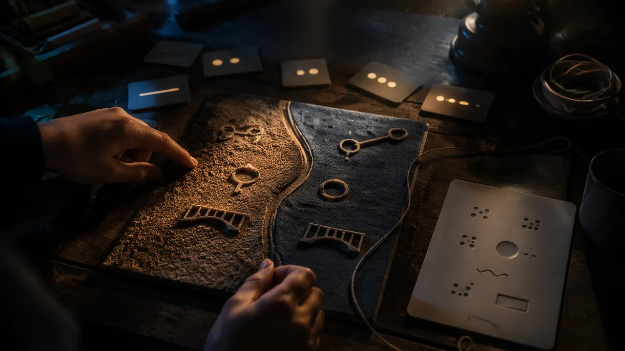
develop a theme, choose symbols and materials that carry it, and plan a tactile work designed for emotional impact, without being required to disclose private experiences.
Instruction
This course asks for a tactile artwork that explores a personal theme or concept and evokes an emotional response. “Personal” does not mean private. You choose how much of yourself to put in, and you are never required to share experiences you would rather keep to yourself.
Three routes to a theme. Personal: an idea that matters to you — a place, a change, an object that holds a memory. Community: something in your neighborhood, school or culture — a building being torn down, a local river, a tradition. Universal: a big idea anyone can enter — time, distance, belonging, repair. The strongest works often connect two routes: a universal idea seen through a particular place or object.
From theme to symbols. A symbol stands for something beyond itself. Some are widely shared (a key for access or secrets, a thread for connection), some belong to a culture (the royal bird on a Yorùbá crown), and some you invent for this work and teach the viewer through repetition. List at least three symbols for your theme, with what each carries.
Materials as symbols. In tactile art the material is often the strongest symbol. Sand can mean time or erosion; a stitched seam can mean repair; rusty-looking texture, age; something soft that a hand wants to hold, comfort. Use your texture library and your matching-collage test from Lesson 3.2 as evidence of what materials carry.
Designing for feeling. Many people associate certain touch qualities with feelings: rough or sharp with tension or danger, smooth and warm with calm, soft with comfort, cold and hard with distance. These associations are common but not universal; they vary between people and cultures, so test them. Plan an emotion map: which parts of the work should a hand meet first, and what should it feel as it moves? A work can change feeling as it is explored — calm at the edges, tense at the center — which is a kind of narrative.
Where the AI image comes in. Look through the course’s image cards (Cards A-D in the machine-image cards reading) for something that resonates with your theme. You may instead generate your own image if a parent or guardian agrees and the tool’s age rules allow it, but never from a photo of a real person. Treat the image as a sketch someone else drew for you: take a shape, a mood, a composition or a detail, and leave the rest. Record the label. Your policy from Lesson 3.3 applies.
Theme statement. Write 100-150 words: your theme and route; what you want a viewer or reader to feel; your three symbols and materials; the AI image and what you are taking from it. Then sketch two versions of the work and choose one by comparing them against your emotion map.
📖 Read for this lesson
The reading opens over the lesson; close it to come back to exactly where you were. The checks below draw on it.
Formative check
Work through these before moving on. They are not graded — they tell you whether the standard below has landed yet.
To explore a personal theme, you must share a private experience in your statement.
Which is the best way to treat the associations between touch qualities and emotions?
Upload your 100-150 word theme statement, your symbol plan (three symbols or materials and what each carries), your emotion map, the AI image label and what you are taking from it, and your two sketches with the reason you chose one.
How confident are you that you can plan a tactile work that carries a theme through symbols and materials?
Building a Theme: Image Sources, a Touch-Feeling Test With Worked Results, a Worked Emotion Map and a Model Theme Statement
SLS original kit; all results and the model statement are invented and illustrative · SLS original (constructed teaching material, illustrative)
Why this reading. The workshop asks you to choose a theme, three symbols, an emotion map and an AI image, to test what materials and touch qualities carry, and to write a 100–150 word theme statement. It sends you to the course’s image cards, and it cites an evidence base (your matching-collage test) that you may not have run. This kit supplies image sources you can use now, a protocol for testing touch and feeling, a worked emotion map and a model theme statement. All of it is SLS original; results are invented and illustrative.
Three routes to a theme (examples)
| Route | Example | Strong when |
|---|---|---|
| Personal, kept general | A place you left and still carry | You choose how much to say |
| Community | A greenhouse at the edge of town that nobody tends any more | A real local thing anchors it |
| Universal | Repair: what it means to mend something that was broken | Anyone can enter it |
The strongest works join two: a universal idea seen through one particular thing (repair, seen through a greenhouse). You never have to disclose a private experience.
Image sources you can use now
Use Cards A–D from the machine-image cards reading, or your own AI image (made only with a parent’s permission, within the tool’s age rules, and never from a photo of a real person) described the same way. Treat the image as a sketch someone else drew for you. A model take-and-leave list:
| Card | Could take | Could leave |
|---|---|---|
| A Lighthouse | The tower as a single upright form; light against dark | The mirrored cliffs; the centered sun |
| B Dunes | The flowing curve; large empty space | The even ripples |
| C Greenhouse | The arches; the broken panes (one in five) | The strict center and even spacing |
| D Terraces | Bands that shrink as they rise; the zigzag path | The sharp midday realism |
Record the label exactly (tool or card, prompt, date) and what you took. That is the start of your disclosure.
Testing what materials and touch qualities carry
Common associations: rough or sharp with tension or danger, smooth and warm with calm, soft with comfort, cold and hard with distance. They are tendencies, not laws. Protocol: make five 5 × 5 cm swatches (sandpaper or crumpled foil, smooth card, soft fabric, wire mesh, cork or wood). Ask up to three readers (family members or other adults), eyes closed, to touch each and say one feeling-word aloud. Record it exactly. With fewer readers, add your own reading: have the swatches mixed up in a bag, touch each with eyes closed and say the first word that comes. Your own words count as one reader, and the worked result below gives you three more to compare with. Worked result (invented):
| Swatch | Reader 1 | Reader 2 | Reader 3 | Pattern |
|---|---|---|---|---|
| Foil, crumpled | tense | cold | noisy | Tense or cold in all three |
| Smooth card | calm | plain | calm | Mostly calm |
| Soft fabric | comfort | comfort | sleepy | Comfort |
| Wire mesh | safe | trapped | tense | Splits: protective or trapping |
| Cork | warm | rough | natural | Warm and natural |
Reading it. Foil, card and fabric agreed. Wire mesh split (safe against trapped), so if you use mesh you must decide which reading you are designing for, or use the split on purpose. The associations vary between people, so test them on your readers.
The emotion map, worked (invented)
Theme: repair. Work: a 20 × 25 cm shadow box. Path: a hand enters at the lower left and moves to the center, then to the right.
| Zone | Meets first? | Material | Intended feeling | Reader reported |
|---|---|---|---|---|
| Lower left edge | Yes | Soft cloth, smooth | Calm, welcome | “Comfortable” |
| Center | Second | A cracked clay pane with a stitched seam | Tension, then care | “Something broken, but held” |
| Right side | Last | Smooth wood, a bead line | Quiet resolution | “A path out” |
The work changes feeling as it is explored: calm, tension, resolution. That is a narrative told by touch.
Choosing between two sketches
Score each sketch 0–2 against the emotion map: does the hand meet the right thing first? does the feeling change where planned? does each symbol have its material? Add up. Worked: Sketch 1 (a flat panel, all zones the same texture): 0 + 0 + 1 = 1. Sketch 2 (three zones): 2 + 2 + 2 = 6. Choose Sketch 2 and write the reason as its scores.
Model theme statement (SLS original, invented; about 130 words)
“Theme: repair, from a community route: a greenhouse at the edge of town. I want a reader to feel something broken that is being held together. Symbols: a stitched seam through a cracked clay pane (repair); a line of small beads along the edge (the broken panes, counted); soft cloth at the entry (welcome). The seam is a symbol shared by many cultures, the beads I invented and will teach through repetition. Image: Card C, greenhouse at dawn (SLS illustrative); I am taking the arched roof and the broken-pane rhythm and leaving the strict symmetry. Made with my own hands and materials; disclosure to follow in the statement.”
Four Machine Image Cards and the Critique Kit: Method, a Worked Critique, a Sculpture Example and a Rubric
Constructed and illustrative: written for this course to stand in for AI-generated images; not real model output and not attributed to any tool, artist or museum · SLS original (constructed teaching material, illustrative)
Why this reading. The critique lab asks you to critique “an AI image” by principle and to recompose it. You cannot critique what you cannot see, and text alone must therefore carry the image. Below are four image cards: each describes, in measured positions, an image of the kind a text-to-image tool typically produces. They are SLS original, written for this course. They are not copies of any real output and are not attributed to any tool, person or museum. If you have your own AI image, use it instead and describe it the same way. The same four cards serve as sources in Lessons 1.4, 1.5, 2.4, 3.4 and 3.5. Positions are (% across from the left, % down from the top).
The four image cards (illustrative)
Card A — Lighthouse at sunset. Illustrative prompt: “a lighthouse on a cliff at sunset, dramatic sky, cinematic”. A white lighthouse stands at (50%, 50%) and fills a third of the picture height. Cliffs on both sides are near mirror images of each other, each about 30% wide. The sun sits exactly behind the tower at (50%, 60%). The horizon is at 65% down. The waves are evenly spaced, near-identical bands. The light is even, the far cliffs are softly blurred and the point of view is at eye level.
Card B — Dune field at dusk. Illustrative prompt: “sand dunes at dusk, golden hour, ultra detailed”. Three ridgelines curve across the picture like slow S-shapes: one runs from the lower left corner (0%, 95%) up to about (70%, 45%), a second lies behind it about 10% higher, and a third is a thin line at the horizon, 40% down. The sky is a smooth gradient and fills the top 40%. A small dark shrub sits at (52%, 60%). Sand ripples repeat across the foreground at equal spacing, about 6% apart.
Card C — Greenhouse at dawn. Illustrative prompt: “abandoned greenhouse at dawn, light through broken glass”. One-point perspective, vanishing point at (50%, 45%). Six iron roof arches march away from the viewer, each smaller than the last, at equal steps in perspective. About one pane in five is broken, in no pattern. A center aisle runs down the middle; plant benches line both sides in matching pairs. A shaft of pale light falls from the upper left across the right benches.
Card D — Terraced hillside at midday. Illustrative prompt: “terraced hillside village, midday sun, photorealistic”. Five terrace bands climb from the bottom edge to the top. Their heights get smaller as they rise: about 30%, 24%, 19%, 15% and 12% of the picture height from bottom to top. A white farmhouse sits at (72%, 40%) on the third band up from the bottom. A zigzag path links the bands, left to right to left. Shadows are short and the whole picture is sharp.
The critique method
Critique one principle at a time. For each of balance, rhythm, proportion, spatial arrangement and emphasis, answer three questions in a sentence each: What is here? (a fact you can point to, with a position or a count) How does it affect a viewer or a hand? What would change it? Then judge the image three ways and name the criteria each time: formal (does it create movement and emphasis?), purpose (what is it for: a calm poster, a dramatic print, a relief for touch?) and tactile (could a hand read it?).
The habits to watch for in machine compositions: a centered subject, near-symmetry, even light, blurred background, a horizon near the middle. These are averages, not errors. A recomposition changes at least one of them on purpose.
Worked critique, Card B (SLS original)
| Principle | What is here | Effect | What would change it |
|---|---|---|---|
| Balance | Asymmetrical. The long ridge sweeps from the lower left to the right; the tiny shrub sits near center. | The sweep pulls the eye right; the shrub is too small to answer it, so the picture leans. | Move the shrub to (75%, 50%) so it sits where the ridge ends. |
| Rhythm | Flowing: three curved ridges and ripples repeating about 6% apart, all alike. | Calm, but the equal spacing never speeds up or slows down. | Make the ripples progressive: 8%, 6%, 4%, 2%, so the eye accelerates toward the horizon. |
| Proportion | Sky 40%, dunes 60%; the shrub is about 2% of the height. | The shrub is too small to be the emphasis, so the sky is the largest thing. | Lower the horizon to 30% for less sky, or enlarge the shrub to about 8%. |
| Space | Deep space by overlapping ridges; the whole lower left is empty. | Open and quiet, with no place to stop. | Keep the empty left corner but add one overlap in front of the shrub. |
| Emphasis | No single strongest point; the eye lands on the sun-lit ridge edge. | Static, atmospheric. | Give the shrub the darkest dark and the sharpest edge. |
Three sets of criteria. Formal: weak to fair; it has flowing rhythm but no emphasis. Purpose (a calm poster): strong, because the even ripples and open sky are restful. Tactile: weak. Under a hand, three identical ripple ridges feel like one, and a 2% shrub disappears. To make it readable, raise the ridges to three different heights and make the shrub a distinct raised knot. One picture, three verdicts, and each verdict names its criteria. Recomposition (words): horizon at 35%; ridge from (0%, 95%) to (75%, 45%); shrub enlarged to about 8% at (75%, 50%); ripples progressive, 8% to 2%.
Critiquing a sculpture: a worked example (SLS original, invented)
Leaning Figure, an invented student sculpture for practice: 18 cm high; wire and foil armature under 6 mm of air-dry clay; a 6 × 6 cm wood base. Front: the figure leans forward about 25 degrees and reaches left; the head is the biggest, roughest form. Side: a clear diagonal from the base to the hand. Back: a flat clay slab, smooth and unmodeled. Balance test: it stays put when nudged from the back and sides, and tips forward when nudged from the front.
Responder’s critique. Balance: the physical balance fails forward because the center of gravity is outside the base at the front; visually the heavy head adds to the forward pull. Rhythm: the ridges on the sleeve repeat at equal spacing and then stop at the elbow. Space: the gap between the arm and the body reads well from the side. Weakest viewpoint: the back, a plain slab with nothing to find. One change: add a counterweight behind, such as a lump of clay for a cloak, widening the base to the rear; the same lump adds a form to the back view. Notice that the critique names a place, gives the reason and offers one action.
Rubric for your critique record
| 3 | 2 | 1 | |
|---|---|---|---|
| Specific | Every claim points to a place, position or count | Some claims point | General words such as “nice” |
| By principle | All five principles, three questions each | Three or four principles | One or two |
| Criteria named | Formal, purpose and tactile, each judged and named | Two sets | One set, unnamed |
| Actionable | A recomposition with positions, or a sculpture change with a reason | A change, no reason | No change offered |