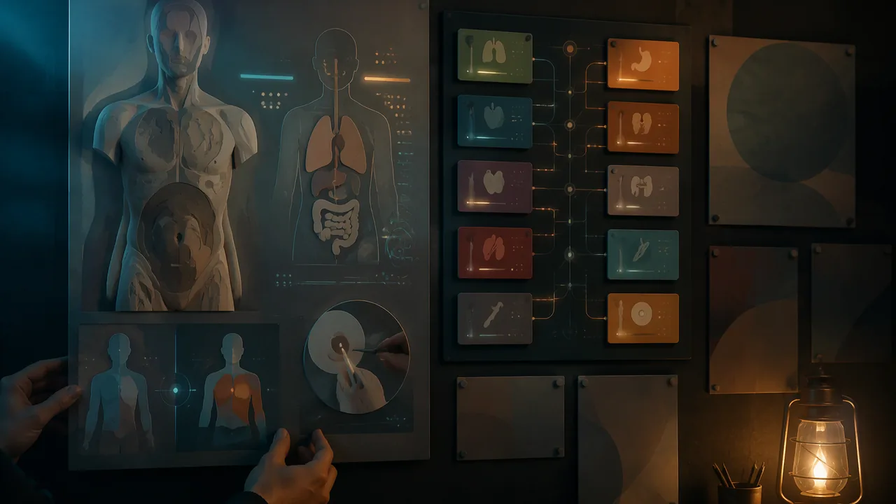
produce an accurate exhibition panel on one organ system and curate it, with an introduction panel, an interaction panel and an atlas key of all eleven systems, into a unified home and online exhibition with a shared visual identity.
Instruction
An exhibition is a media artwork in its own right. The order of the pieces, the shared design system, the introduction, the wall or screen layout and the way visitors move through it all shape what they understand. This task asks you to make your panel and to curate a small exhibition around it.
Your panel. It combines four elements: a photograph of your sculpted model; an original labeled diagram in a view you chose on purpose; the normal-versus-affected comparison for one common condition; and a small inset on how clinicians examine the system or detect the condition. Every claim must be supported by OpenStax Anatomy and Physiology 2e or a federal health source, cited in small type at the bottom.
The shared identity. The reading for this lesson sets out a visual identity: panel size and orientation, a grid (title band at the top, diagram on the left two-thirds, caption and inset on the right), one heading typeface, one body typeface and a color code for each of the eleven systems. Every piece in your exhibition follows it, so a visitor can compare systems; your own voice shows in how you draw, compose and choose your view. You may change a rule in the brief if you say why in your artist statement.
Curating. A curator decides what visitors see and in what order. Besides your full panel, you make three supporting pieces. The atlas key is one sheet showing all eleven systems as small tiles in the brief’s color code, each with its name and one function, arranged in one of three ways: by function (support and movement; control; transport and exchange; processing and waste; reproduction), as a journey through the body, or as an interaction map with lines connecting systems that work together. Your system’s tile points to your panel. The introduction panel says what the atlas is, who made it and how to read a panel. The interaction panel shows how your system works with at least one other, for example how the respiratory and cardiovascular systems together deliver oxygen to cells.
Showing it at home and online. Hang or lay out the pieces at home in the order you chose, on a wall, a door or a table, and invite your household to walk through it if you like. Then gather the same pieces, in the same order, into a PDF or slide catalog with alternative text for every image. The catalog may be shared online only with a parent’s or guardian’s permission, and it shows no personal information beyond a first name. Plan for access either way: text large enough to read at a meter and a recorded audio guide.
The artist statement. In about 600 words, explain your system and your chosen structure-function relationship, your view and style choices and what inspired them (cite a Lesson 3.1 work), how your curation order guides a visitor, how your self-review changed your panel, and what your sources were.
The four stages. Stage 1: panel plan with thumbnail, chosen curation arrangement, source list and model photos. Stage 2: draft panel reviewed by you twice after a day away, once with the brief’s design checklist and once, on a different day, with its accuracy checklist; an optional family member or other adult may tell you what they see first. Submit both checklists and your revision plan. Stage 3: final panel, supporting pieces, catalog and artist statement. Stage 4: a recorded two-minute audio guide in which you walk a visitor through your panel and answer the course’s published visitor questions.
📖 Read for this lesson
The reading opens over the lesson; close it to come back to exactly where you were. The checks below draw on it.
Formative check
Work through these before moving on. They are not graded — they tell you whether the standard below has landed yet.
Why does every piece in your exhibition follow one grid and typeface system from the course brief?
A panel may recommend a treatment for its condition if the maker believes it works.
How confident are you that you can produce an accurate exhibition panel and curate a unified exhibition around it?
Unit 3 checkpoint
Do this before you start the task. It covers the whole unit and tells you what to review first.
Whose anatomy book was illustrated with wood engravings that print the names of structures directly on the parts?
A view of the body as if sliced through, as in CT and MRI, is a .
Coloring veins blue is a convention, not a fact about blood color.
Which system returns fluid to the blood and houses immune cells?
The six levels of organization run chemical, cellular, , organ, organ system, organism.
Tapping on the body to hear whether a region is hollow or solid is:
Teach-back tests:
A good health visual shows everything the clinician knows about the condition.
Why should a panel use value (light and dark) as well as hue?
On the panel, labels use everyday words first and the term second.
The atlas panel may state treatments for the condition as long as they sound reasonable.
Submit: Body Atlas panel + introduction panel, interaction panel and atlas key + catalog + 600-word artist statement + recorded audio guide
Task: Design an exhibition panel for one organ system that combines your model photograph, an original labeled diagram, a normal-versus-affected comparison for one common condition and an inset on examination or detection. Curate it into a small exhibition with an introduction panel, an interaction panel and an atlas key of all eleven systems, shown at home and gathered into a PDF or slide catalog (online only with a parent’s permission), and record an audio guide.
Submission workflow
- Stage 1 — Plan. Thumbnail on the brief’s grid, model photographs, condition chosen, curation arrangement chosen and a source list.
- Stage 2 — Double self-review. After a day away, check the draft panel against the brief’s design checklist; on another day, check it against the accuracy checklist. An optional family member or other adult may give a first-look reaction. Submit both checklists and your revision plan.
- Stage 3 — Revised final. Final panel, introduction panel, interaction panel, atlas key, the PDF or slide catalog and the 600-word artist statement.
- Stage 4 — Audio guide. A recorded two-minute audio guide to your panel that also answers the course’s published visitor questions.
How it is scored
| Criterion | What proficient looks like |
|---|---|
| Presentation and curation (MA:Pr6A.I) | Panel fits the shared identity and sits in an exhibition whose order and design guide visitors’ understanding. |
| Production quality and personal voice (MA:Cr3A.II) | Deliberate, well-crafted choices of view, composition and style within the shared system. |
| Integration of art and science (MA:Pr4A.I) | Model, diagram, comparison and inset work together to explain the system and condition. |
| Scientific accuracy (WHST.11-12.2) | Every label and claim is correct and supported by a named source; no advice or unsupported claims. |
| Critique and revision (MA:Re9A.I) | Both self-reviews are addressed with specific, visible changes. |
Portfolio Brief: The Body Atlas, with a Shared Grid, Computed Color Code, an Atlas Key, a Home and Online Showing, an Exemplar and Two Self-Review Checklists
SLS original brief and constructed exemplar; contrast ratios computed with the WCAG 2.1 formula (W3C 1.4.3); color-vision prevalence from the National Eye Institute; asthma facts from NHLBI; retrieved Sept. 26, 2026; solo curation, home and online showing, self-review checklists and visitor questions adapted for RLP as SLS original (2026-11-10) · SLS original
Why this reading. The task asks you to follow a shared visual identity, curate your panel into a small exhibition and show it at home and as a catalog. This is the complete brief: the shared grid with measurements, a color code with computed contrast, the atlas key and three curation arrangements worked through, the introduction and interaction panels, how to show it at home and online, an exemplar panel outline and artist-statement excerpt, the rubric levels, the two self-review checklists and the published visitor questions for your audio guide. The exemplar is an SLS original, not a student’s or an institution’s work; you may change a rule here if you explain why in your artist statement.
The panel, in inches (the shared grid)
Portrait, 24 × 36 in for print (or 1920 × 2880 pixels for a screen exhibit), margin 1 in, giving a live area of 22 × 34. Bands from the top: title band 4 in tall (system name at least 96 pt, in the system’s color); main band 22 in: the diagram on the left two-thirds (14.5 in wide) and, on the right third (7.5 in), the caption at the top, the model photograph beneath it and the examination inset at the bottom; a comparison strip 5 in tall under the main band (normal beside affected, same scale and view); a source line 1 in tall at 18 pt or larger for the print size. Heading typeface one family, body typeface one family, at least 24 pt for body text at 24 × 36 in so a visitor a meter away can read it. If you work smaller, scale every figure by the same factor: a half-size panel (12 × 18 in) halves every number above.
A color code for the eleven systems (computed)
| System | Header color | Contrast with white title text | Also give it a pattern or icon |
|---|---|---|---|
| Integumentary | #8C4A2F | 6.7 : 1 | yes: the color alone is never the only cue |
| Skeletal | #5B5B5B | 6.8 : 1 | yes: the color alone is never the only cue |
| Muscular | #A32020 | 7.5 : 1 | yes: the color alone is never the only cue |
| Nervous | #5A3E9B | 8.1 : 1 | yes: the color alone is never the only cue |
| Endocrine | #B25E00 | 4.7 : 1 | yes: the color alone is never the only cue |
| Cardiovascular | #8E1B3A | 8.9 : 1 | yes: the color alone is never the only cue |
| Lymphatic | #1B6B4A | 6.5 : 1 | yes: the color alone is never the only cue |
| Respiratory | #1F5F99 | 6.7 : 1 | yes: the color alone is never the only cue |
| Digestive | #6B6B00 | 5.6 : 1 | yes: the color alone is never the only cue |
| Urinary | #0F6F73 | 5.9 : 1 | yes: the color alone is never the only cue |
| Reproductive | #7A2F72 | 8.5 : 1 | yes: the color alone is never the only cue |
All eleven header colors reach the 4.5 to 1 minimum for normal text against white text (WCAG 2.1, criterion 1.4.3), computed with the WCAG formula. Several are dark and some are close in hue, and about 1 in 12 men have color vision deficiency (National Eye Institute), so print the system name in the title band and add a pattern or an icon; do not rely on color alone.
The atlas key and three ways to curate it
You make one full panel, but the atlas covers all eleven systems through the atlas key: one sheet (the same 24 × 36 in grid, or a letter-size version) with eleven small tiles, each carrying the system’s name, its header color and pattern or icon from the table above, and one function from the Lesson 3.2 reading. Your system’s tile is outlined and marked “see panel.” Arrange the tiles in one of these three ways and say in your artist statement why you chose it.
| Arrangement | Order | What visitors learn | What it hides |
|---|---|---|---|
| By function | Support and movement (skeletal, muscular, integumentary); control (nervous, endocrine); transport and exchange (cardiovascular, lymphatic, respiratory); processing and waste (digestive, urinary); reproduction (reproductive) | Systems that share a job sit together | How systems from different groups depend on each other |
| A journey | Follow a breath of air, then a meal, then a signal: respiratory, cardiovascular, digestive, urinary, nervous, and so on | The body as a story | Systems left off the path |
| An interaction map | Tiles placed anywhere; lines connect systems that work together | Dependence between systems | Simple reading order |
The introduction panel says what the atlas is, who made it (a first name is enough) and how to read a panel (the parts, in the order the eye should take them). The interaction panel shows how your system works with at least one other. Worked example (SLS original, checkable from the lesson’s own text): the respiratory system exchanges oxygen and carbon dioxide; the cardiovascular system carries oxygen to cells and carries wastes away; the panel draws the lungs, the heart, and one loop between them with arrows and labels, and says what each system does in that loop.
Showing it at home and online
At home. Put the pieces up in your chosen order on a wall, a door or a table: introduction panel first, then the atlas key, your full panel, the interaction panel and, if you like, the clay model itself on a card base. Use painter’s tape or a removable adhesive so nothing is damaged, and ask before using a wall. Invite your household to walk through it if you like, and play your audio guide beside your panel. The catalog. Photograph or export each piece and put them, in the same order, into a PDF or slide deck: a cover, one page per piece, a one-sentence label under each, and alternative text for every image (one or two sentences saying what the image shows). Online. The catalog goes online only with a parent’s or guardian’s permission, in a place they approve, showing no personal information beyond a first name and no photos of people.
An exemplar panel outline (SLS original; respiratory, asthma)
Title band: “Respiratory system” in the system’s blue (#1F5F99, contrast 6.7 to 1). Diagram: a side view of the airways drawn by the maker, with labels in a column at the left and straight leader lines. Comparison strip: a small airway open and the same airway narrowed, same scale and view, using the proportions in the technique sheet for Lesson 3.4 (60 mm outer edge; open space 52 mm against 36 mm plus mucus). Caption: the 53-word caption from Lesson 3.4. Inset: “How a clinician checks: listen to the lungs with a stethoscope.” Model photograph: the clay branching model with a caption “enlarged, not to scale.” Sources: NHLBI asthma pages (retrieved 26 September 2026).
Artist-statement excerpt (about 130 of 600 words; SLS original). “I chose a side view of the airways because it lets one column of labels serve the whole drawing, and I used the atlas blue for the title band and for one line in the diagram so the panel reads as part of the atlas. My personal choice is the model: I photographed it against the same blue so the photo and the drawing look like one piece. I decided not to show any treatment. The NHLBI page I used describes the condition and its changes to the airways; recommending what to do is a clinician’s job, and my panel would only be guessing. I checked every label against the source in the table on my planning sheet, and marked ‘enlarged, not to scale’ on the model because the real air sacs are microscopic.”
What each level looks like
| Criterion | Not yet | Proficient | Advanced |
|---|---|---|---|
| Presentation and curation | Panel ignores the shared grid; no reason for the exhibit order | Follows the grid and color code; the atlas key uses a reasoned arrangement | The panel and its place in the order teach something a single panel cannot |
| Production quality and personal voice | No deliberate choice of view; unfinished labels | View chosen and explained; crafted labels and layout | A recognizable personal decision that also serves the shared system |
| Integration of art and science | Model, diagram, comparison and inset say different things | All four support one relationship | The inset explains how the condition is found, linked to the diagram |
| Scientific accuracy | Unsourced or wrong labels; treatment advice | Every label and claim traceable to a named federal source; no advice | Also states what the panel leaves out and why |
| Critique and revision | Reviews not addressed | Both self-reviews answered with visible changes | Explains a suggestion not taken, with evidence |
The two self-review checklists
Do these on two different days, at least a day after you finish the draft, so you see it with fresh eyes. An optional family member or other adult can help with item 2 of the design checklist: ask them what they look at first, second and third, without explaining anything.
Design checklist (day 1). (1) Does the panel follow the shared grid? List any measure that differs. (2) What does a first-time viewer see first, second, third? (3) Is any color doing two jobs? (4) Is any label hard to read at a meter? Give the contrast of one text color if you can compute it. (5) Two changes, each with what, where and why.
Accuracy checklist (day 2). (1) Pick five labels or claims and find each in your named source. Record: matches, does not match, or no source. (2) Does the panel recommend any treatment or make a claim beyond its source? (3) Does the comparison keep the same scale and view? (4) One correction, with the source that supports it.
Revision plan: a table with three columns: finding, change (or reason not), where it appears in the final. Include every finding from both checklists.
The audio guide
Record two minutes on your panel (a phone voice memo is enough). A workable script (about 260 words at 130 words a minute): 20 seconds on which system and which condition; 60 seconds walking the eye through the panel in the order you designed; 30 seconds on what you chose to leave out; 10 seconds on the source. Then, on the same recording, answer these published visitor questions in a sentence or two each: (1) Why did you choose this view of the system? (2) What is the one thing a visitor should remember about the condition? (3) Where does your system sit in the atlas key, and why there? (4) What did you change after your self-review?
Sources: W3C WCAG 2.1, Understanding Success Criterion 1.4.3: Contrast (Minimum) (w3.org); National Eye Institute, Color Blindness (nei.nih.gov); NHLBI, Asthma (nhlbi.nih.gov)