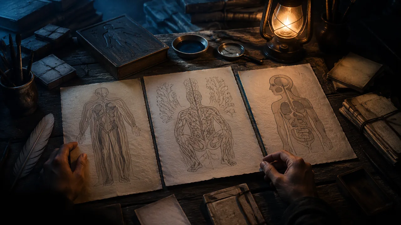
analyze how anatomical images from different cultures and centuries use visual conventions to make the body understandable, and identify the view types I can use in my own work.
Instruction
For centuries, the only way most people could see inside a body was through an artist’s image. Anatomical illustration is where art and medicine have always met, and its makers solved exactly the problem you face: how to show something complex, hidden and three-dimensional on a flat surface so that someone else understands it.
Andreas Vesalius, De humani corporis fabrica (1543). Vesalius, a physician teaching in Padua, based his book on his own dissections rather than on ancient texts alone, and corrected errors that had been repeated for centuries. Its large woodcut illustrations were made by artists, often associated with the workshop of Titian, though the exact attribution is debated. Its famous muscle figures stand in landscapes, posed like living people, with layers of muscle removed from one plate to the next. The design idea is sequence by layer: each image peels back what the previous one showed.
Mansur ibn Ilyas, Anatomy of the Human Body (late fourteenth century). This Persian treatise, dedicated to a Timurid ruler, includes full-body diagrams of the skeleton, nerves, muscles, veins and arteries, each drawn as a frontal figure in a squatting pose, with a separate figure for each system. It is a schematic approach: the drawings show connections and pathways rather than realistic appearance, and they separate the body into systems much as you will.
Kaitai Shinsho (1774). Japanese physicians including Sugita Genpaku translated a Dutch anatomy book into Japanese after comparing its illustrations with a dissection and finding them far more accurate than the texts they had been taught. The book shows images crossing languages and cultures and changing medical practice.
Gray’s Anatomy (1858). Henry Gray’s text was illustrated by Henry Vandyke Carter, a surgeon-artist whose wood engravings print the names of structures directly on the parts instead of using numbered keys. This direct labeling made the images faster to read and is one reason the book lasted.
View types you can use. A cutaway removes part of an outer surface to show what lies beneath. A cross-section shows the body as if sliced (the view used in CT and MRI). A schematic simplifies to show connections and flow, like a subway map of the circulatory system. An exploded view separates parts slightly to show how they fit together. A sequence shows change over time or layer by layer.
Conventions and their meaning. Medical illustrations traditionally color arteries red and veins blue. That is a convention, not a fact about blood color; all blood is red, darker when it carries less oxygen. Conventions help readers, but you should know which parts of an image are fact and which are code.
Looking closely. For each work, ask: what view type is used? What was left out to make it clearer? How is the viewer’s eye guided? What does the image assume about its viewer? These are the questions you will ask of your own atlas panel.
📖 Read for this lesson
The reading opens over the lesson; close it to come back to exactly where you were. The checks below draw on it.
Formative check
Work through these before moving on. They are not graded — they tell you whether the standard below has landed yet.
Which view type would best show how blood flows from the heart to the lungs and back, ignoring realistic appearance?
Veins are colored blue in anatomical drawings because the blood in them is blue.
Vesalius, Fabrica (1543)
Tap to revealDissection-based; layer-by-layer woodcut figures posed as living people
Mansur ibn Ilyas (late 14th c.)
Tap to revealPersian schematic figures, one per system
Kaitai Shinsho (1774)
Tap to revealJapanese translation of a Dutch anatomy after comparing its images with a dissection
Gray and Carter (1858)
Tap to revealDirect labeling on wood engravings
Compare two of the four works. For each, name the view type, one thing the artist left out to make it clearer, and how the viewer’s eye is guided. Which approach will you borrow for your panel, and why?
How confident are you that you can analyze historical anatomical images and choose a view type for my own work?
Practice
Work these on paper or in your notebook, then open Check your answer. Aim for all of Fluency and Application; try at least one Challenge.
Printable version: this unit’s practice workbook (PDF)
Fluency
Build speed and accuracy with the core skill.
- Match each work to its date and its key design idea: Vesalius’s Fabrica; Mansur ibn Ilyas’s Anatomy of the Human Body; Kaitai Shinsho; Gray’s Anatomy (drawings by Carter). Dates: 1543, late 14th century, 1774, 1858. Ideas: direct labeling; sequence by layer; one schematic figure per system; images crossing languages after comparison with a dissection.
Check your answer
Answer: Fabrica, 1543: sequence by layer. Mansur ibn Ilyas, late 14th century: one schematic figure per system. Kaitai Shinsho, 1774: a Dutch anatomy translated into Japanese after its images were compared with a dissection. Gray’s Anatomy, 1858: direct labeling by Henry Vandyke Carter.Each work solved the problem of showing a hidden, three-dimensional body on a flat surface in a different way. - Define each view type in one phrase: cutaway, cross-section, schematic, exploded view, sequence.
Check your answer
Answer: Cutaway: removes part of an outer surface to show what lies beneath. Cross-section: the body as if sliced (the CT and MRI view). Schematic: simplified to show connections and flow. Exploded view: parts separated slightly to show how they fit. Sequence: change over time or layer by layer.These are the five view types you can use in your own panel. - True or false, and explain: arteries are drawn red and veins blue because that is the color of the blood inside them.
Check your answer
Answer: False. It is a convention. All blood is red, darker when it carries less oxygen.Conventions help readers, but you should know which parts of an image are fact and which are code.
Application
Use the skill in context. Show your reasoning.
- Choose the best view type for each goal and explain briefly: (a) show the chambers inside the heart; (b) show the path of nerves from the spinal cord to the hand; (c) show how the bones of the skull fit together; (d) show an organ as it appears on an MRI.
Check your answer
Answer: (a) Cutaway (a heart cut open shows the chambers). (b) Schematic (connections and pathways). (c) Exploded view (parts separated to show fit). (d) Cross-section (the sliced view used in CT and MRI).Match the view to the job: what lies beneath, how things connect, how parts fit, or one plane. - Compare Vesalius’s muscle figures with Mansur ibn Ilyas’s figures. For each, name the approach and one thing it makes easy to understand.
Check your answer
Answer: Vesalius: realistic figures posed like living people in landscapes, with muscle layers peeled back from plate to plate; it makes depth and layering easy to follow. Mansur ibn Ilyas: schematic frontal figures in a squatting pose, one per system; it makes connections and pathways within one system easy to see.A strong answer names the approach (sequence by layer versus schematic) and connects it to what the viewer learns. - Why did Carter’s direct labeling help Gray’s Anatomy last? Give one situation where a numbered key would still be the better choice.
Check your answer
Answer: Names printed directly on the structures make the image faster to read, because the viewer does not jump between numbers and a key. A numbered key is better when parts are too small or crowded for names to fit.Lesson 3.4 makes the same point: direct labeling is an alternative when parts are large enough. - What does the story of Kaitai Shinsho show about images, according to the lesson? Answer in 2 sentences.
Check your answer
Answer: Japanese physicians including Sugita Genpaku compared the Dutch book’s illustrations with a dissection and found them far more accurate than the texts they had been taught, so they translated it. The images crossed languages and cultures and changed medical practice.A strong answer names the comparison with a dissection as the evidence that convinced them.
Review
Keep earlier skills sharp.
- Review 1.1: Vesalius’s plates peel back one layer at a time. Which of the three design moves from Unit 1 (encoding, hierarchy, sequence) is this, and why?
Check your answer
Answer: Sequence: the reader’s eye is led through the explanation in order, each plate revealing what the previous one covered.Sequence by layer is the lesson’s name for this idea.
Four Anatomical Works Described: Vesalius (1543), Mansur (c. 1390), Kaitai shinsho (1774) and Gray and Carter (1858)
A. Vesalius, De humani corporis fabrica (Basel, 1543), NLM copy, Internet Archive 2295005R.nlm.nih.gov, fol. 174-176; Mansur ibn Ilyas, Tashrih-i badan-i insan, NLM MS P 18 (1488 copy); Kaitai shinsho (Edo, 1774), NLM UID 101147255, Internet Archive 101147255X1.nlm.nih.gov; H. Gray, Anatomy, Descriptive and Surgical (London, 1858), Fig. 53 p. 66, Internet Archive anatomydescripti1858gray; NLM Circulating Now; all retrieved Sept. 26, 2026 · Public domain (works of 1543, c. 1390/1488, 1774 and 1858), with SLS original descriptions; the Latin index of the Fabrica is paraphrased in SLS translation
Why this reading. The comparison chart asks you to name each work’s view type, say what the artist left out and how the eye is guided, and the lesson names four works without showing any. Here each is described from the scan itself (page or plate, layout, labeling, what is shown and what is not), with its record, what its makers wrote and what the National Library of Medicine says. What to look for: what each image shows, what it leaves out, and how a reader is told which part is which. All four works are in the public domain; I describe them in my own words and quote only from the 1858 and 1543 texts. The four are far older than this course’s vocabulary, so view names such as “cutaway” are my labels for you to test.
1. Andreas Vesalius, De humani corporis fabrica libri septem (Basel: Johannes Oporinus, June 1543)
The record. Folio, 43 cm; National Library of Medicine call number WZ 240 V575dh 1543 OVR; the colophon reads “Basileae, ex officina Ioannis Oporini, anno salutis reparatae MDXLIII. Mense Iunio.” A scan of the NLM copy is at the Internet Archive (identifier 2295005R.nlm.nih.gov). Public domain. Retrieved 26 September 2026.
The image described: the second muscle plate, folio 174. One large woodcut fills the page. A muscled man is seen from the side, facing left, striding, head thrown back, one arm raised with the hand open toward the upper left, the other arm stretched down and back. The skin is gone: individual muscles, with their tendons, are drawn as fibrous bands over the bones. Small letters, Roman and Greek, are printed directly on the muscles. At the lower left is a ruined stone arch overgrown with plants; at the right, hills with a small town. A title, “Secunda musculorum tabula,” sits at the upper left. The letters are explained in an index in italic type on the following pages (folio 176 begins with lines such as “Musculus … extendentium inferior”). So the eye is guided by the pose (a gesture that leads from the raised hand down the body), and the reader by a letter key kept off the picture.
The sequence. Book II has fourteen numbered muscle plates, each with its own letter index (“Characterum index”). In my translation of the Latin, the index to the second plate says it corresponds entirely to the first as regards the dissection, but turned to the side, and shows the same muscles; the index to the fourteenth says it is the last of the plates showing the back of the body, lacks shoulder blades and arms, and bends the knee so the sole of the foot can be seen. The index to the seventh mentions that the cord from which the body hung while it was drawn had been loosened. The indexes point to other plates (the index to the second plate refers to the ninth), so each figure is a numbered step in a series and not a picture that stands alone.
What NLM says. The NLM’s Circulating Now post on the illustrations says it is unknown who the artist or artists were, that some images were probably first sketched by Vesalius himself and then finished by a trained artist, that the old theory naming Jan Stephan van Calcar is doubted, that the landscapes behind the muscle figures have been identified as the Euganean Hills near Padua and form a continuous panorama, and that the muscles are indexed by letters. The NLM’s Vesalius page says he performed his own dissections and confirmed or refuted many of Galen’s claims.
2. Mansur ibn Ilyas, Tashrih-i badan-i insan (Anatomy of the Human Body), fl. c. 1390; NLM MS P 18, copied in Isfahan, completed 8 December 1488
The record. Persian illustrated manuscript, treatise by Mansur ibn Muhammad ibn Ahmad ibn Yusuf ibn Ilyas (fl. c. 1390) of Shiraz, dedicated to a Timurid ruler; NLM shelf mark MS P 18 (a second copy is MS P 19); scribe Hasan ibn Ahmad. Note that the treatise is from the late fourteenth century, but this copy is from 1488. Public domain (manuscript of the fifteenth century). Source: NLM, Islamic Medical Manuscripts, MS P 18 page, retrieved 26 September 2026.
The images described. The NLM record says the treatise has an introduction followed by five chapters on five systems of the body, bones, nerves, muscles, veins and arteries, each illustrated with a full-page diagram; all the figures are in a squatting posture. The skeleton (folio 12b) is seen from behind with the head bent back so the mouth is at the top; the nerves (18a) are drawn from the back; the muscles (20a) are shown from the front with long written captions naming the muscles; the veins (25b) and arteries (28a) are drawn from the front with the internal organs indicated. A final chapter deals with compound organs such as heart and brain and with the formation of the fetus, and its folio 39b figure is essentially the arterial figure with a pregnant uterus containing a fetus in a breech or transverse position drawn onto it. A correction to the lesson: the lecture says each figure is frontal; the NLM says the skeleton and nerve figures are seen from behind.
Reading it. Each system gets its own body: the artist separates the layers by drawing the same posed figure five times, not by peeling one figure. That is a schematic approach: the figure is a support for the network of lines and captions, not a portrait of a body.
3. Kaitai shinsho (New Book of Anatomy), Edo (Tokyo): Suharaya Ichibe, 1774
The record. Five volumes, National Library of Medicine, NLM UID 101147255; translated from Johann Adam Kulmus’s Tabulae anatomicae by Sugita Genpaku and Maeno Ryotaku, with illustrations by Odano Naotake, and proofreading by Nakagawa Jun’an and Katsuragawa Hoshu. The NLM catalog says it is the first complete translation of a Western anatomy book in Japan and states that the item is in the public domain. Scan of the head volume: Internet Archive 101147255X1.nlm.nih.gov. Retrieved 26 September 2026.
The images described. The illustration volume opens with a framed title design in Western style: a stone cartouche with a figure standing at each side. Plates that follow are Japanese woodblock prints with Japanese headings in columns of characters. The full-skeleton plate (see the head volume, about the 42nd image) shows the skeleton from the front down to the thighs, the skull turned slightly, hands hanging open, the ribs drawn as overlapping bands, with a separate shoulder blade set at the upper right. Small letters in the Japanese syllabary are printed on the bones and keyed to the text. Another plate, of the diaphragm, shows a dissected torso hung from a cord, with insets of the diaphragm alone and of a breast in section, and two small figures of the chest opened, each with head and hair drawn in Western fashion. The pages mix whole figures with details on the same sheet.
Reading it. The point of the work as history is its route: a Dutch text of Kulmus (from a German original) into Japanese. The images travel across languages and cultures; the labels change to kana, the drawings stay recognizable. The NLM and reference summaries also report that Genpaku and colleagues watched a dissection in 1771 and found the Dutch book’s figures matched what they saw, which prompted the translation; this rests on the reference sources, not on the pages I viewed.
4. Henry Gray, Anatomy, Descriptive and Surgical, drawings by H. V. Carter (London: John W. Parker and Son, 1858)
The record. The title page reads “the drawings by H. V. Carter, M.D.” and “the dissections jointly by the author and Dr. Carter.” Scan from the Countway Library, Harvard, at the Internet Archive (anatomydescripti1858gray). Public domain. Retrieved 26 September 2026. (Later editions, such as the 1918 American edition on the Internet Archive as graysanatomydesc0000tbjo_e9o6, are also public domain and are the versions most readers have seen.)
What Gray wrote. The preface says the osteology is “illustrated by numerous accurately-lettered engravings, shewing the various markings and processes on each bone,” that muscle attachments are shown in dotted lines, that the muscles are shown in fifty-two engravings, and that “all the drawings from which the engravings were made, were executed by” Carter, in most cases “copied from, or corrected by, recent dissections, made jointly by the Author and Dr. Carter.” The engravers were Butterworth and Heath. Its counts: 27 engravings for the arteries, 72 for the nervous system, 50 for the viscera.
The image described: Fig. 53, “Roof, Floor, and Outer Wall of Nasal Fossae,” page 66. One engraved figure in the middle of a page of text: a side view of the bones of the nose and palate, cut open. It is a line engraving with no color and no background, no body and no landscape, only the parts. The labels are written in italic script directly on the page, outside the drawing, in three groups: “Roof” at the top left, “Floor” at the lower left, and “Outer Wall” at the right, each group a neat column of names (Nasal Bone, Sphenoid, Ant. Nasal Spine, Palate Proc. of Palate, Superior Meatus, Middle Meatus and others) joined to their parts by thin, mostly straight leader lines. Two extra notes, “Probe passed through Naso-lachrymal Canal” and “Bristle passed through Infundibulum,” explain instruments used to show hidden channels. The caption is one line above the figure; the surrounding paragraph cites “fig. 53.” The eye is guided by the leader lines and grouping, not by pose.
The comparison chart, with one worked row
| Vesalius (1543) | Mansur (c. 1390; copy 1488) | Kaitai shinsho (1774) | Gray and Carter (1858) | |
|---|---|---|---|---|
| View type (my labels) | Realistic surface-to-depth series of whole-body plates | Schematic: one posed figure per system | Realistic, mixed: whole figures and insets on one sheet | Line diagram of parts, cut open, with direct labels |
| How the reader knows which part is which | Letters on the muscles, keyed to an index on later pages | Captions on the figure (muscles) and the text | Kana letters on the parts, keyed to the text | Names engraved outside the drawing with leader lines |
| What is left out | Skin, fat, most vessels and nerves on each plate | Realistic appearance, organ shapes, background | Most detail of small structures; color | Whole body, context and setting; everything but the part described |
| How the eye is guided | Pose and gesture leading through the figure | The strict squat pose and columns of captions | Placement of insets around one main figure | Grouped label columns and straight leader lines |
The view types, defined. Realistic: shows the shapes as seen. Schematic: simplified to show connections or pathways. Cutaway: part of the outer surface removed to show what lies inside. Exploded: parts drawn separated but in their order of assembly. Layered sequence: a series of images, each removing a layer. Decide for yourself which of these best fits each image; the table shows my choices, and you may argue for others.
Sources: Vesalius, De humani corporis fabrica (1543), NLM copy at the Internet Archive (archive.org); NLM Historical Anatomies on the Web: Vesalius bibliographic information (nlm.nih.gov); NLM Circulating Now, Illustrating De Fabrica (circulatingnow.nlm.nih.gov); NLM Islamic Medical Manuscripts, MS P 18 (Mansur ibn Ilyas) (nlm.nih.gov); Kaitai shinsho, NLM Digital Collections (NLM UID 101147255) (collections.nlm.nih.gov); Gray, Anatomy, Descriptive and Surgical (1858), Internet Archive (archive.org)