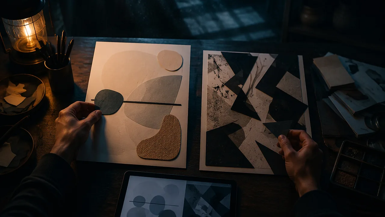
use line, shape, value, texture and space deliberately to express a mood, by hand and in vector software, and explain which element carries the meaning.
Instruction
Before designers work with color, photographs or type, they work with the basic visual elements. The BCcampus text Graphic Design and Print Production Fundamentals calls these the basic things that can be seen. Every design, from a logo to a website, is built from them.
Point and line. A point marks a position. A line is a point in motion, and its character carries feeling. A thin horizontal line feels calm and stable, like a horizon. A diagonal line feels active, because it looks as if it is falling or rising. A jagged zig-zag line reads as tension or energy; a slow curve reads as gentle. Lines can also be implied: a row of dots, or the direction a person in a photograph is looking, creates a line the eye follows.
Shape. A shape is an enclosed area. Geometric shapes (circles, squares, triangles) feel ordered and manufactured; organic shapes (leaf- or blob-like) feel natural and human. A triangle resting on its base is stable; the same triangle balanced on its point feels precarious. Shapes also create negative space, the area around and between them, which is itself a shape. Skilled designers design the negative space as carefully as the positive.
Value. Value is lightness or darkness. Strong value contrast (black on white) draws the eye and reads from far away; close values (two mid-grays) feel quiet and can become hard to read. Many designers check a color design by viewing it in grayscale to test whether the values still separate.
Texture. Texture is the surface quality a design has or suggests: smooth, rough, grainy, woven. In print, texture can be real (the paper) or visual (a pattern). On screen it is always visual.
Space. Space is the distance between and around things. Crowding elements together creates tension or urgency; generous space creates calm and importance. White space (which does not have to be white) is not wasted space. It is how a design tells you what matters.
Color and form are also elements. You will study color in depth next semester, and form (the illusion of three dimensions) when you work with shading and images.
Worked example. Suppose the word is calm. A strong solution might be one long, thin horizontal line placed low in a mostly empty square: a horizontal line for stability, lots of space for quiet, low placement for weight settling down. For tension, you might crowd three sharp black triangles into one corner so they almost touch the edge and each other: sharp shapes, crowding, and near-contact at the edges all produce unease. Notice that each explanation names an element and a reason. That is the habit this studio builds: every mark is a decision you can explain.
By hand, then digital. You will make your studies with markers and paper first, because hand work is fast and lets you try many ideas. Then you will rebuild one study in Inkscape, a free vector program, using the rectangle, ellipse, star/polygon and Bezier (pen) tools and the Fill and Stroke dialog. Notice what changes: digital shapes are perfectly clean, and you can move and resize them endlessly, but you may lose the energy of a hand-drawn line.
Working safely. Design is desk work, and the injuries are real but preventable. Set your screen at or slightly below eye level about an arm’s length away, keep wrists straight, and follow a common eye-strain guideline: every 20 minutes, look at something about 20 feet away for about 20 seconds.
📖 Read for this lesson
The reading opens over the lesson; close it to come back to exactly where you were. The checks below draw on it.
Studio: Six Words, Six Squares
Question. How can you communicate an abstract idea using only black shapes, lines and space, with no pictures, words or color?
Materials
- Six 4 x 4 inch squares of white drawing paper or cardstock (or a sheet ruled into six squares)
- Black markers in two widths, a pencil and an eraser
- Black construction paper, a glue stick and safety scissors (for cut-paper versions)
- A ruler
- A computer with Inkscape installed (free and open source; no account needed), or, for the no-device route, graph paper, a ruler and a compass
- Cut away from your body with scissors and keep blades closed when passing them; do not use craft knives in this studio.
- Use a glue stick, not spray adhesive, to avoid fumes.
- Set up your workstation before the digital step: screen at or just below eye level, feet flat, wrists straight; take a 20-second far-focus eye break every 20 minutes.
- Save your Inkscape file to your course folder every ten minutes and keep a second copy (a USB drive or a cloud folder your parent has approved).
Procedure
- Write these six words lightly on the back of your six squares: calm, tension, growth, chaos, balance, speed.
- For each word, sketch at least two tiny thumbnails in your notebook before committing. Use only black lines, black shapes and white space: no letters, recognizable pictures or color.
- Make the final version of each square in marker or cut black paper. Keep the square’s edges clean so the composition’s boundary is clear.
- Test your squares on a viewer. Ask a family member or other adult to guess the word for each square from the list of six, without seeing which is which, and record how many they matched. If no one is available, shuffle the squares, set them aside until the next day, then match them to the six words yourself before turning them over.
- Choose the square that communicated least clearly. In Inkscape, create a 4 x 4 inch document (File > Document Properties), rebuild the composition with shape tools and the Bezier tool, and change one element (line weight, shape, value or spacing) to make the word clearer.
- Export the digital version as a PNG and a PDF (File > Export), and photograph or scan your six paper squares.
Data
| Word | Main element used | Viewer’s guess (or your next-day guess) | Match? (Y/N) | What carried the meaning |
|---|---|---|---|---|
| calm | ||||
| tension | ||||
| growth | ||||
| chaos | ||||
| balance | ||||
| speed |
Analysis
- Which square did your viewer (or your next-day self) read correctly, and which element (line, shape, value, texture or space) made it work? Explain in one or two sentences.
- For the square you rebuilt digitally, what did you change and why? Did the change make the word clearer to a second viewer?
- What did the hand version do better than the digital version, and what did the digital version do better?
If you cannot do this studio in person: No-device route: work entirely on paper using any black pen and paper, and draw the six squares with a ruler. For the digital step, redraw your least clear square on graph paper using only exact shapes made with the ruler and compass (circles, rectangles, straight-sided polygons), label each shape the way Inkscape would (shape type, size in inches, fill and stroke), and write which one element you changed to make the word clearer.
Formative check
Work through these before moving on. They are not graded — they tell you whether the standard below has landed yet.
A student wants a composition to feel unstable. Which choice best supports that?
White space in a design is wasted space that should be filled.
An image made of mathematical paths that scales without losing sharpness is a graphic; the area around and between shapes is space.
Describe your workstation setup for the digital step: where is the screen, how are your wrists and feet, and when will you take eye breaks?
How confident are you that you can use line, shape, value, texture and space deliberately to express a mood?
Elements Lab Sheet: Six Words, One Worked Composition, Solo Testing and the Labeling Format
SLS original lab sheet; constructed example · SLS original
Why this reading. The lab asks for six hand-made compositions expressing six words, one rebuilt in vector software, with a labeled explanation of which element carries the meaning. This sheet gives the six words, one worked composition, and the labeling format, so you can start right away and test your squares on your own. It is an SLS original.
The six words
calm · tension · growth · chaos · balance · speed. Make each in black and white first, on a square 4 by 4 inches (four fit on a letter sheet, so six need two sheets), using only line, shape, value, texture and space. No letters and no recognizable objects.
Worked example: fragile, a seventh word for practice (SLS original)
Description: a very thin, light-gray line wanders from the upper left and stops in a break near the middle; a small pale circle sits alone in the lower right corner, with roughly two thirds of the square left empty around it; a few hairline cracks radiate from the circle; the paper is left smooth. Label: Line: thin and broken, so it reads as weak. Shape: one small circle, so it reads as alone. Value: light, so it reads as easily lost. Texture: smooth, which makes the cracks the only rough thing, so the eye goes to them. Space: mostly empty and lopsided, so the circle feels exposed. Element that carries the meaning: space, because the same circle and line inside a crowded square would read as ordinary.
Rebuilding one in vector software
Choose the composition with the simplest shapes. Redraw each shape as a path, set the line width in points, and keep the same proportion (square). A vector version scales without losing sharpness, which the hand version cannot do. As the lesson says, two circles with one offset and Path > Difference make a crescent.
Testing the squares without a classroom
With a viewer. Give a family member or other adult the list of six words and the six squares in shuffled order, words hidden on the back. Ask them to write a word for each square. Count the matches: 4 of 6 is 4 ÷ 6 ≈ 67 percent. Without a viewer. Shuffle the squares face down, put them away until the next day, then match each to a word before turning it over. You will remember some of your own intentions, so treat a next-day self-test as weaker evidence than a viewer’s guesses, and say so in your analysis.
Rebuilding without a device
Redraw the least clear square on graph paper using only exact shapes from a ruler and compass, and label each one as a vector object: shape type, size in inches, fill (black or none) and stroke width. That label list is the same information an Inkscape file stores.
Your labeling format
For each composition write the word, then one sentence each for line, shape, value, texture and space, then the one element that carries the meaning and why.