use proportion, scale and a consistent type scale to structure a poster, and develop a visual metaphor for a theme that communicates across cultures.
Instruction
Proportion is the size relationship of parts to each other and to the whole. Scale is how big something is compared with what we expect or with its surroundings. Both can be planned with simple mathematics, and both carry meaning.
Paper has proportions. A US tabloid poster is 11 × 17 inches, a ratio of 17 ÷ 11 ≈ 1.55. International paper sizes (A4, A3 and so on) use a ratio of about 1.414 (the square root of 2): A4 is 210 × 297 mm, and 297 ÷ 210 ≈ 1.414. That ratio was chosen because cutting a sheet in half gives a smaller sheet of the same proportion. Knowing your format’s ratio keeps thumbnails, roughs and finals consistent.
The rule of thirds. Divide the page into thirds horizontally and vertically. Placing a focal point on one of the four intersections, rather than dead center, usually creates a more dynamic composition. On an 11 × 17 poster the vertical guides fall at 11 ÷ 3 ≈ 3.67 and 7.33 inches, and the horizontal guides at 17 ÷ 3 ≈ 5.67 and 11.33 inches. It is a guideline, not a law.
The golden ratio, carefully. You will read that the golden ratio (about 1.618) is the secret of beautiful design and appears in famous logos and buildings. Some designers do use it to size rectangles and columns, and it is a harmonious proportion. But many popular claims about it are exaggerated or unsupported, and it is not required for a design to work. Use it as one tool among several, and be skeptical of any source that says it explains everything.
A type scale. Consistent proportion also applies to type sizes. Pick a base size and a ratio, and multiply. With a 16-point base and a ratio of 1.25, the sizes are 16, 20, 25, 31.25 and about 39 points (16 × 1.25 = 20; 20 × 1.25 = 25; and so on). On a poster you might use a larger base and ratio. The point is that sizes related by one ratio look planned; random sizes (17, 22, 29, 44) look accidental.
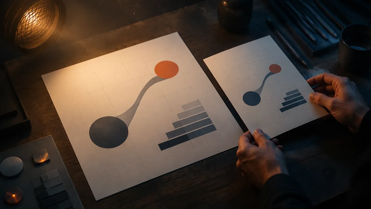
Scale for meaning. Exaggerated scale can be a visual metaphor: a single enormous water drop above a tiny city says “water sustains the whole city”; a small child beside a giant stack of books says “reading is a big adventure.” Unexpected scale stops the eye and invites interpretation.
Designing across cultures. Your principles poster addresses a theme that people in many cultures share, such as water, home, harvest, family or a new year. Universal themes are shared, but symbols and colors are not. White is associated with weddings in many Western traditions and with mourning in parts of East and South Asia; red signals danger in some contexts and good fortune and celebration in Chinese tradition. An owl suggests wisdom in some cultures and bad luck in others. Hand gestures are especially risky: a gesture that means “OK” in one place can be offensive in another. Before you commit to a symbol, research what it means to the communities in your audience, using at least one reliable source and, where possible, asking adults you know from those communities, with a parent’s knowledge. Avoid borrowing sacred or ceremonial imagery from a culture that is not yours.
Plan, then draft. Write your proportion plan (format, margins, thirds guides, type scale), your metaphor and your symbol research, then build the first digital draft.
📖 Read for this lesson
The reading opens over the lesson; close it to come back to exactly where you were. The checks below draw on it.
Formative check
Work through these before moving on. They are not graded — they tell you whether the standard below has landed yet.
With a 16 pt base and a 1.25 ratio, the next three type sizes are 20 pt, pt and pt.
On an 11 x 17 inch portrait poster, where do the vertical rule-of-thirds guides fall?
Because a theme like ‘home’ is universal, any symbol for it will mean the same thing to every audience.
Describe your poster’s visual metaphor and explain, with your source, what its main symbol or color means to at least two different audiences.
How confident are you that you can plan a poster’s proportions and type scale and choose a visual metaphor that works across cultures?
Proportion and Symbols Sheet: An 11 by 17 Plan, a Computed Type Scale and a Worked Symbol Note
SLS original sheet; Library of Congress item 99615924; Wikipedia, DOT pictograms; retrieved Sept. 26, 2026 · SLS original (with public-domain record)
Why this reading. The workshop asks for a proportion plan (format, margins, thirds guides, type scale), a researched symbol note and a first draft. You need the numbers and a model of the note. SLS original arithmetic; sources named where used.
Proportion plan for an 11 × 17 in. portrait poster, worked
Ratio: 17 ÷ 11 = 1.545. For comparison, international A-series paper has a ratio of 1.414 (A4 is 210 × 297 mm; 297 ÷ 210 = 1.414), and a rectangle 11 in. wide in the golden ratio (1.618) would be 11 × 1.618 = 17.8 in. tall, so 17 in. is close but not the same. Margin 0.75 in.: live area 9.5 × 15.5 in. Thirds guides on the full page: vertical at 11 ÷ 3 = 3.67 in. and 22 ÷ 3 = 7.33 in.; horizontal at 17 ÷ 3 = 5.67 in. and 34 ÷ 3 = 11.33 in. Put the focal point on one of the four crossings, for example (3.67, 5.67), rather than dead center (5.5, 8.5). Print size in pixels at 300 ppi: 3,300 × 5,100; with a 0.125 in. bleed, 11.25 × 17.25 in. is 3,375 × 5,175 px.
Type scale, worked
The lesson’s example, base 16 pt and ratio 1.25: 16, 20, 25, 31.25, 39.06. For a poster, base 18 pt and ratio 1.5: 18 × 1.5 = 27; 27 × 1.5 = 40.5; 40.5 × 1.5 = 60.75; 60.75 × 1.5 = 91.1. Assign: body 18, subhead 27, date and place 40.5, headline 91 pt (cap height about 91 × 0.7 = 64 pt = 0.89 in.). Sizes 17, 22, 29 and 44 have no single ratio and look accidental.
Scale as metaphor
One huge water drop over a tiny city says the city depends on it; a small figure beside a giant harvest basket says abundance. Unexpected scale stops the eye.
How to research a symbol, with a worked note
Rules: use at least one reliable source and, where possible, ask people from the community; for any claim about what a color or symbol means, find two independent sources; prefer a museum, archive or community-authored source to a blog; do not borrow sacred or ceremonial imagery from a culture that is not yours.
Worked note (SLS original, with a verified record). Symbol: the skull. Source: a printed broadside by José Guadalupe Posada, published in Mexico City in 1907 (Library of Congress 99615924, no known restrictions). What the source shows: skeletons and skulls in a crowded, comic scene with an electric streetcar and verse about the first of November; the skull is lively and satirical, not only grim. Audience 1: readers familiar with Mexican print traditions, for whom skull imagery is part of a festive tradition. Audience 2: viewers elsewhere, for whom a skull may read as danger or horror. Status: the second reading is my inference and needs two sources before I rely on it. Decision: use a small, dignified motif, not a skull, for a poster meant for both groups. For your own note, do the same for your poster’s main symbol or color.
Note about pictograms
The U.S. DOT/AIGA Symbol Signs were built to be read by travelers who do not share a language; designers reviewed symbols already used around the world before drawing their own (per the Wikipedia article “DOT pictograms,” which cites the 1974 report). That is the same research habit.
Sources: Library of Congress, Gran calavera eléctrica (99615924) (loc.gov); Wikipedia, DOT pictograms (en.wikipedia.org)