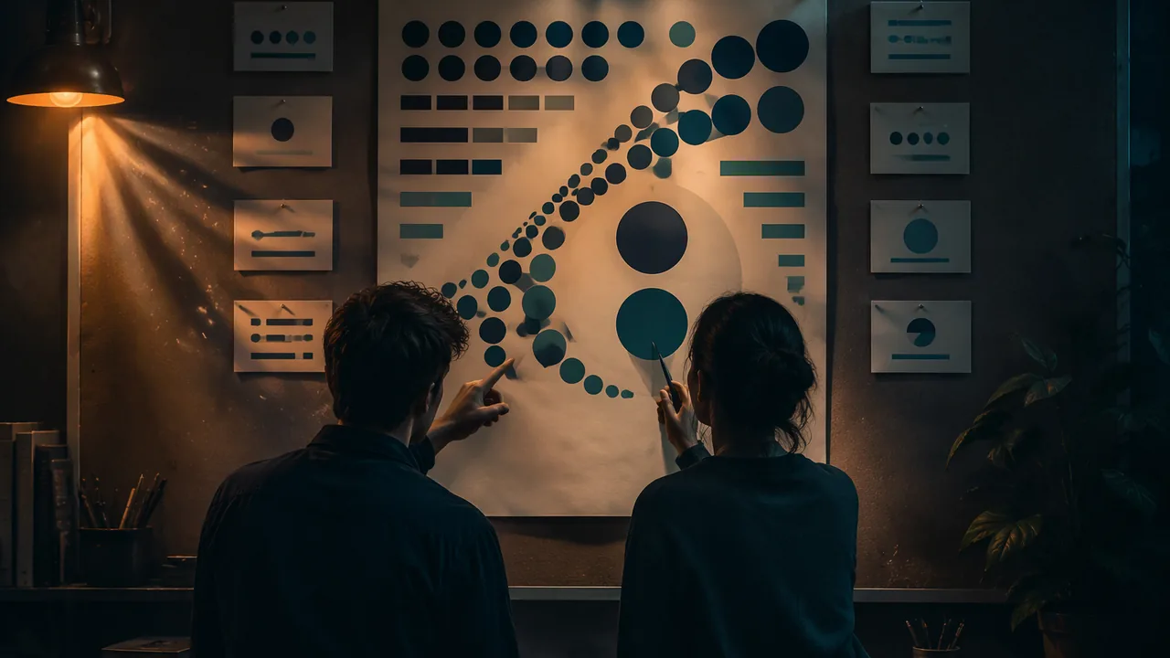
identify repetition, rhythm, movement, unity and Gestalt grouping in professional work and sample posters, and defend an analysis with visual evidence in a structured critique.
Instruction
Repetition and rhythm. Repeating an element, such as a color, a shape, a typeface or a spacing interval, ties a design together and builds consistency. When repeated elements have a regular or progressive pattern, they create rhythm, the visual equivalent of a beat. Regular rhythm (identical intervals) feels steady; progressive rhythm (elements that grow or shrink step by step) feels like motion; irregular rhythm feels lively or tense. In multi-page work, repetition is what makes page 7 look like it belongs with page 1.
Movement is the path the eye travels. Designers create it with lines (real or implied), diagonals, directional shapes such as arrows, the gaze of people in photos, and sequences from large to small. A good design leads the eye through the hierarchy and then to the call to action, not off the edge of the page.
Unity is the sense that everything belongs together. Consistent type choices, a limited palette, repeated shapes, shared alignment and a single concept all create unity. Its partner is variety; too much unity is boring and too much variety is chaos.
Gestalt principles. Early twentieth-century German psychologists studied how people perceive whole patterns rather than separate parts; Gestalt roughly means “form” or “whole.” Designers use their findings constantly. Proximity: close items form a group. Similarity: items that share color, shape or size seem related. Closure: the mind completes incomplete shapes, so a circle drawn with gaps still reads as a circle; many logos rely on this. Continuation: the eye follows lines and curves past intersections. Figure-ground: we separate a figure from its background, and clever designs make the negative space form a second image. Common region: items inside a shared boundary group together.
Distortion as a message. Distortion (stretching, warping, exaggerating scale) changes meaning. Editorial illustrators exaggerate features to make a point; a headline that is visibly squeezed into a box looks careless. When you see distortion in critique, ask whether it serves the message or undermines it.
Defending an analysis. In an aesthetic analysis, a claim is only as strong as the visual evidence behind it. “The poster has unity” is a claim. “The poster has unity because the same orange appears in the headline, the button and the border, and all text aligns to one left edge” is a defended claim. In critique you should be able to point to the evidence.
The principle hunt protocol. Work with the designs in the lab reading. For each one, look for one minute without reading its analysis, then write three principles you see, each with the evidence (where exactly it is). Only then compare your record with the worked record in the reading. Where you found a principle the worked record does not list, or missed one it does, write why. Close each hunt with one “what if” suggestion. Keep each hunt to eight minutes. In Lesson 4.5 you will run the same protocol blind on your own poster, with your intended principles sealed, or ask an adult viewer to run it for you.
Evaluating reasoning in critique. Test every claim, including your own, the way you would evaluate an argument: is the evidence specific and accurate? If a claim says “there’s no alignment,” check the guides before accepting it.
📖 Read for this lesson
The reading opens over the lesson; close it to come back to exactly where you were. The checks below draw on it.
Formative check
Work through these before moving on. They are not graded — they tell you whether the standard below has landed yet.
Which critique comment is a defended aesthetic claim?
Closure
Tap to revealThe mind completes a shape with gaps
Similarity
Tap to revealItems sharing color, shape or size seem related
Continuation
Tap to revealThe eye follows a line or curve past intersections
Figure-ground
Tap to revealSeparating figure from background; negative space can form a second image
Progressive rhythm
Tap to revealRepeated elements that change step by step
Distortion always weakens a design.
Describe one claim from your principle hunt that disagreed with the worked record in the reading, or that you had to check and revise. What was the evidence on each side, and how did you resolve it?
How confident are you that you can identify rhythm, movement, unity and Gestalt grouping and defend my analysis with visual evidence?
Principle Hunt Set: Three Public-Domain Designs Described, Two Worked Records, One to Hunt and Three Sample Posters
Library of Congress items 99615924, 98518589, 98510089; retrieved Sept. 26, 2026 · Public domain (Posada 1907; WPA posters with no known restrictions on publication), with SLS original analysis
Why this reading. The lab asks you to identify repetition, rhythm, movement, unity and Gestalt grouping and defend each claim with visual evidence. You need designs to hunt in. This reading describes three, gives worked principle-hunt records for two, and leaves the third for you. Records retrieved Sept. 26, 2026; all three works are public domain; the analyses are SLS original.
Design 1: Posada, Gran calavera eléctrica (1907)
Library of Congress 99615924, published by Antonio Vanegas Arroyo, Mexico City; relief print, black on cream; “No known restrictions.” Full description in the reading “Three Designs Across Eras” (Lesson 1.3): title across the top, a huge skeleton at left facing hundreds of heaped skulls and an electric streetcar at right, a thick patterned border, and four columns of verse below.
| Principle | Evidence (where exactly) |
|---|---|
| Repetition and rhythm | Hundreds of similar round skulls in the central picture; four verse columns of the same width; a repeating small pattern in the border |
| Movement | The skeleton’s raised, pointing arm and leaning body send the eye right, across the skulls to the streetcar |
| Unity | One ink color and one printing technique across title, picture, verse and border |
| Deliberate distortion | The skeleton is far larger than the streetcar: exaggerated scale that carries the joke |
Design 2: See America. Visit the national parks (WPA, 1936-40)
Library of Congress 98518589; full description in the reading “Design at Work” (Lesson 1.1): a near-symmetrical view of two brown cliffs framing a cream waterfall, olive tree masses at both edges, SEE AMERICA at top, VISIT THE NATIONAL PARKS below.
| Principle | Evidence |
|---|---|
| Figure-ground | The waterfall is the paper’s own cream, a pale shape held between two dark brown masses; the negative space is the subject |
| Continuation | The vertical cliff edges run down the sheet and lead the eye to the spray at the bottom of the fall |
| Repetition | Two matching olive tree masses at left and right; the same stippled texture along every edge |
| Unity | A limited palette of olive, brown, lavender, teal and cream; both text lines in a related serif capital |
Design 3: for you to hunt (WPA, 1936-41)
See how W.P.A. Welfare Services Protect Americans, Library of Congress 98510089 (described in Lesson 1.1): a blue field with large light-blue stars, a huge red W.P.A, cream lettering, a cream panel, and a red block at lower right holding the place and dates. Write three principles, each with evidence. Hint areas: the repeated stars (similarity, rhythm, and what happens where the stars are cut off by the panel); the way the red block overlaps the cream panel (common region, layering); the palette (unity).
Defending a claim
Weak: “It has unity.” Defended: “It has unity: the same cream appears in the script, the capitals and the panel, and one blue field sits behind every word.” If a claim says “no alignment,” check first. In Design 1 the four verse columns are equal in width and start at the same height, so the claim fails; a challenge is resolved by pointing.
Sample poster notes, worked (constructed poster)
Sample poster A, about water: a huge blue drop hangs above a tiny row of houses at the bottom, headline flush left under the drop, in one blue and one yellow. Notes: Scale contrast: the drop fills half the page and the houses stand about one twentieth as tall. Unity: only two colors, the same yellow in headline and sun. Suggestion (what if): repeat the drop small three times down the left edge to add rhythm. Now write notes, with evidence in each line, for the two sample posters below.
Sample poster B, about home (constructed). An 11 × 17 in. portrait poster. A row of five identical small orange house shapes runs across the bottom third, evenly spaced 1 in. apart; above them a large curved line, drawn as an arc of a circle, links the first roof to the last like a roof over all five. The headline, “Home is people,” is centered under the arc in dark brown capitals; a short line of body text is centered below the houses. Cream background; only orange and brown.
Sample poster C, about a shared celebration (constructed). An 11 × 17 in. portrait poster. Twelve circles in four bright colors are scattered at different sizes across the top half, some cut off by the edge; the headline “Everyone is invited” runs diagonally from lower left to upper right across the middle in heavy black type, squeezed horizontally so the letters look narrow; the date and place sit in a small box at the bottom right.
For each, name three principles with exact evidence and one “what if.” Hint: in B look for repetition, regular rhythm, closure and continuation along the arc; in C look for movement on the diagonal, irregular rhythm, and whether the squeezed type is deliberate distortion or an error.