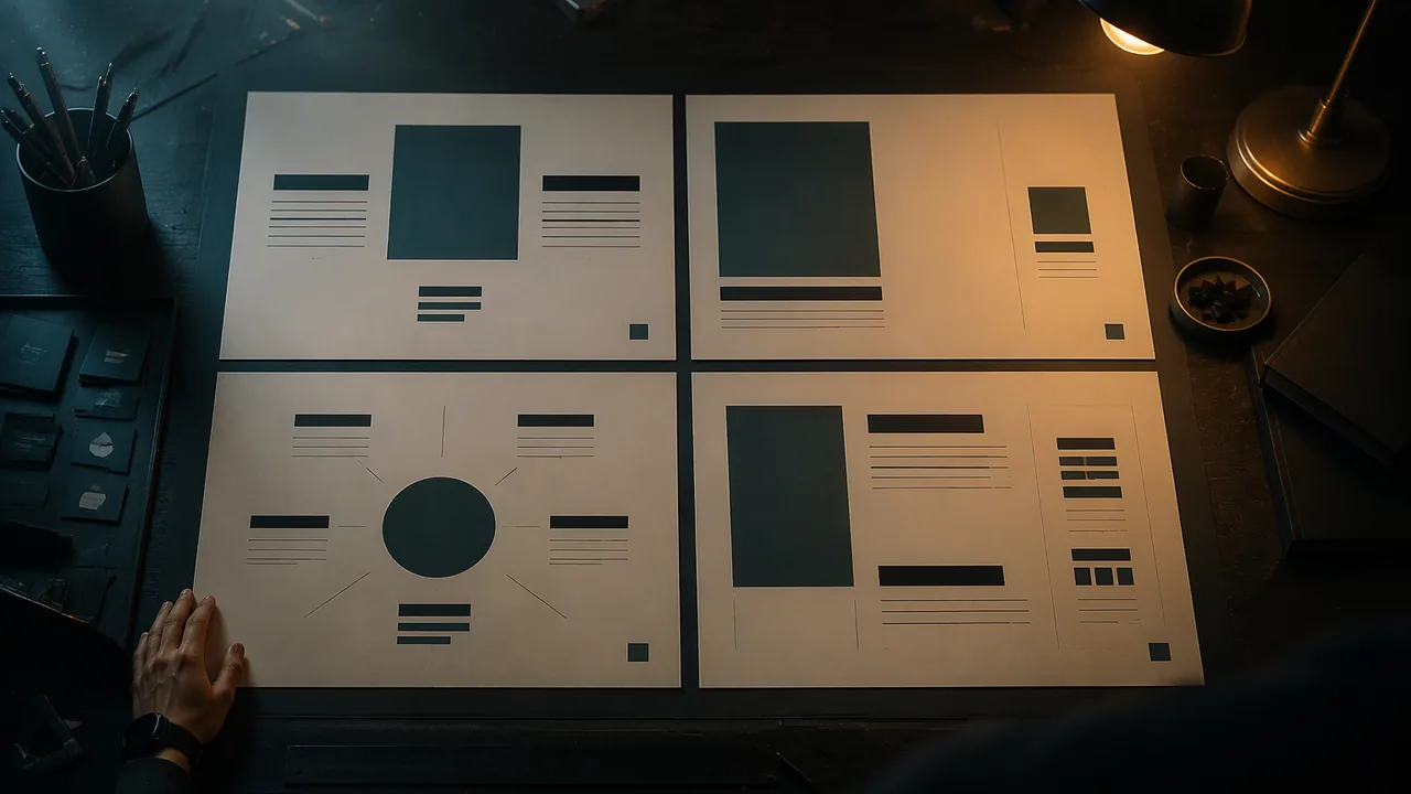
arrange the same content using symmetrical, asymmetrical and radial balance and a strict alignment system, and test which arrangement communicates most clearly.
Instruction
Now you will use the principles, not just name them. This studio gives you a fixed content set: a headline, a subheading, an image area, a short paragraph, event details and a small logo. You will arrange it four ways.
Balance is the distribution of visual weight. Large, dark, saturated, textured or isolated elements weigh more. Symmetrical balance mirrors elements across a central axis: formal, stable, traditional, often used for invitations and certificates. Asymmetrical balance places unequal elements so they still feel balanced, like a small child far out on a seesaw balancing an adult near the middle. A large image on the left can be balanced by a small, dark block of text far to the right. Asymmetry feels dynamic and modern. Radial balance arranges elements around a center point, like spokes or a target. It creates a strong focal point.
Alignment means every element lines up with something else. Designer and author Robin Williams summarized four basic principles as contrast, repetition, alignment and proximity, and her rule for alignment is that nothing should be placed on the page arbitrarily. Invisible lines connect aligned elements and make a design look organized. A common beginner habit is centering everything; centered text is fine for short, formal pieces, but a strong flush-left edge is often clearer and more dynamic. Use your software’s guides and alignment tools. In Inkscape, open Object > Align and Distribute and choose what to align relative to, such as the page or the first selected object.
Proximity means related items belong close together and unrelated items apart. Date, time and place are one group; keep them together, with more space around the group than inside it. When everything is equally spaced, the viewer cannot tell what belongs with what.
Space holds it together. Consistent margins and gaps make a layout feel intentional. A useful habit is to pick one spacing unit, for example 0.25 inch, and use only multiples of it.
Scale and a little distortion. Changing the size relationship between elements changes the story. A tiny figure in a vast empty space reads as lonely or small; the same figure filling the frame reads as powerful. Stretching or squashing type or photos, though, is a distortion viewers notice immediately. It usually looks like an error, unless it is clearly deliberate and carries meaning.
Worked example. In an asymmetrical version, a student places a large photo covering the left 60% of the page, aligns the headline and the event details to a single vertical guide at the right, groups date, time and place in one tight block, and places the small logo at the bottom right, aligned to the same guide. The photo’s weight is balanced by the dense, dark headline on the other side; one alignment line organizes all the text; proximity groups the details. Each decision uses a named principle.
Testing. A layout is not finished because it looks nice to you. Show each of your four versions to a family member or other adult for five seconds and ask them to point, in order, to what they saw. If no one is available, use the self-test in the lab reading: after a day away, glance at each version for five seconds from across the room and write down the order you noticed things. Compare the order with your intended hierarchy.
📖 Read for this lesson
The reading opens over the lesson; close it to come back to exactly where you were. The checks below draw on it.
Studio: Same Content, Four Layouts
Question. Which kind of balance and alignment makes the same content clearest for its audience, and does the viewer read it in the order you intended?
Materials
- The content set in the lab reading (headline, details, body text, scan code, logo and image), printed or on screen
- Four sheets of 8.5 x 11 paper, a pencil, a ruler, safety scissors and a glue stick (for a cut-paper version)
- A computer with Inkscape or Scribus (free; no account needed), or paper only for the no-device route
- A timer, and a family member or other adult as a viewer if one is available
- Use safety scissors and a glue stick; no craft knives or spray adhesive.
- Set up your workstation ergonomically and take a 20-second far-focus eye break every 20 minutes.
- Save each layout as a numbered version (layout_sym_v01, layout_asym_v01, and so on) and keep a backup copy.
Procedure
- Write your intended hierarchy for the content kit: the order you want a viewer to notice the six items.
- Make four layouts, by cut paper first if you like, then in Inkscape at 8.5 x 11 inches: (A) symmetrical, (B) asymmetrical, (C) radial, (D) a strict alignment version where every item aligns to one or two vertical guides.
- Use the same content in every version; you may change size, position, grouping and space, but not the words.
- Check each version: turn on guides, confirm every element aligns with something, and confirm the details are grouped by proximity.
- Reading-order test: show each version to your viewer for five seconds, then ask them to point to items in the order they noticed them, and record the order. With no viewer, run the next-day self-test from the lab reading.
- Compare each recorded order with your intended hierarchy and mark matches.
Data
| Layout | Intended order (1-6) | Viewer’s order (or next-day self-test) | Items in the intended position (0-6) | Notes |
|---|---|---|---|---|
| A Symmetrical | ||||
| B Asymmetrical | ||||
| C Radial | ||||
| D Strict alignment |
Analysis
- Which layout matched your intended hierarchy most closely? Name the principles that made it work.
- In the layout that matched least, where did the viewer’s eye go instead, and why? Which principle would you change?
- Which layout best suits the event’s audience and tone (for example, a formal awards night or a skate-park opening)? Justify your choice with your results.
If you cannot do this studio in person: No-device route: complete all four layouts in cut paper or pencil, run the reading-order test on the paper versions, and photograph them flat in daylight if a camera is available. Use a ruler to draw the alignment guides in light pencil.
Formative check
Work through these before moving on. They are not graded — they tell you whether the standard below has landed yet.
Which layout uses asymmetrical balance?
Date, time and place are spread evenly across the page with the same space as everything else. Which principle is missing?
Stretching a photo to fill a space is a neutral technical fix that viewers rarely notice.
Report your reading-order results for the best and worst layouts and explain the difference using at least two principles.
How confident are you that you can arrange content with deliberate balance, alignment and proximity and test the reading order?
Four Layouts Sheet: A Content Set, Exact Coordinates for Four Layouts and a Worked Reading-Order Test
SLS original lab sheet; constructed results · SLS original
Why this reading. The lab asks you to lay out the same content four ways, test which reads best and write a comparison. This sheet supplies the content set, exact coordinates for four layouts on a US Letter page, and a worked test with results, so you can check your method. SLS original; the results are constructed.
The content set (food bank poster)
Headline: Build Saturday. Details: Saturdays, 8:30-11:30 a.m. / Valley Harvest Food Bank, 400 Dock St. Body: Ages 15+ welcome. Earn service-learning hours. Scan code (1.25 in. square). Logo (1.5 in. wide). Crate drawing.
Four layouts, measured from the top-left corner (live area x 0.5 to 8.0, y 0.5 to 10.5)
| Layout | Placement |
|---|---|
| 1 Symmetrical | Everything centered on x = 4.25 (half of 8.5). Headline y 0.75-2.0; crate 5 × 3.5 in. at x 1.75-6.75, y 2.4-5.9; details, body, then code and logo centered below. |
| 2 Asymmetrical | Crate 4 × 6 in. at x 0.5-4.5, y 0.5-6.5 (large, light); a dark text block 3 in. wide at x 5.0-8.0 holding headline, details and body (small, dense, dark); code and logo bottom right. The large light mass balances the small dark one. |
| 3 Radial | Logo at the center (4.25, 5.5). Around it at a radius of 3.0 in.: headline at top (4.25, 2.5), details at right (7.25, 5.5), place at bottom (4.25, 8.5), code at left (1.25, 5.5). |
| 4 Strict alignment | A single left edge at x = 0.75 for every block; ragged right. Headline y 0.75; crate 7.0 in. wide (x 0.75-7.75); details, body, code and logo stacked on the left edge with equal 0.4 in. gaps. |
Reading-order test
Show each layout to up to five people you know (family members or other adults) for five seconds, hide it, and ask: “What did you see first? What is it asking you to do?” Then show it again and time how long they take to find the date. Score two things per layout: how many named the headline first, and how many found the date in 10 seconds.
Self-test, if no viewer is available. Put the four layouts away for a day. Then stand across the room, look at each for five seconds, turn it over and write the first three things you noticed; then time yourself finding the date. Because you made the layouts, label these results as a self-test and treat them as weaker evidence than a viewer’s.
Worked results (constructed)
| Layout | Headline first | Date found in 10 s |
|---|---|---|
| 1 Symmetrical | 4 of 5 | 4 of 5 |
| 2 Asymmetrical | 5 of 5 | 5 of 5 |
| 3 Radial | 2 of 5 | 3 of 5 |
| 4 Strict alignment | 5 of 5 | 5 of 5 |
Report: “Layouts 2 and 4 were best (5 of 5 on both); layout 3 was worst (2 of 5 saw the headline first, 40 percent), because four items of similar size compete around the logo (no single emphasis) and there is no left-to-right path. Layouts 2 and 4 both give the headline the largest size and one clear starting point. With only five testers this is evidence, not proof.” Do not stretch a photo to fill a space; crop or scale it in proportion.