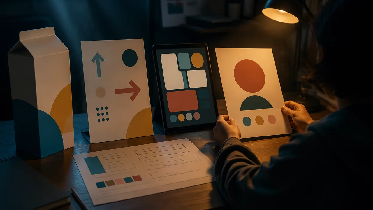
present three real-world designs from different industries with an analysis of how each communicates, and present an original flyer with a reflection connecting it to a definition of graphic design.
Instruction
This project brings the unit together: you will show that you can read design and make it.
Choosing three examples. Pick three designs from three different fields: for instance one package, one wayfinding sign or map, and one app screen or website; or one book cover, one public-service poster and one logo in use. Photograph them yourself where you can, or use images from sources that allow reuse, and record where each came from. For each example you need a clear image, the sender, the audience, the message, the medium, and an analysis that names at least two visual elements and explains what they do. Use the four critique steps from Lesson 1.3 in order.
What a strong analysis sounds like. Weak: “The cereal box is colorful and eye-catching.” Strong: “The box uses a single saturated yellow across the whole front, which separates it from the darker boxes around it on the shelf; the brand name is the largest, highest-contrast element, so it is read first, and the photograph of the bowl sits at the child’s eye level on a low shelf.” The strong version names elements, explains their effect and connects them to the audience and setting.
Your flyer. Revise the draft from Lesson 1.4 using your Stage 2 self-critique and any notes from an adult viewer. Check it against four criteria: a clear message in one reading; a hierarchy a stranger can follow in the order you intended; a visual metaphor or concept this audience will understand; and a correct, print-ready PDF with all essential information inside the margins. Use only images you made or that you have permission to use, and fonts you are licensed to use (the SIL Open Font License fonts installed on your device are fine).
The talk. You record the talk (video, or audio over your slides) and have four minutes. Spend about two on the three examples and two on your flyer. Show, do not read: put images on the slides and keep text short. Explain one choice in your flyer that you changed after feedback and why. Close by answering, on the same recording, one question from the list in the project reading, such as why you chose your metaphor for this audience.
The reflection. In 250-350 words, write your own definition of graphic design and use your flyer as evidence. Which part of your definition does the flyer demonstrate well, and which part is it still missing?
This is your first portfolio piece. Save the final PDF, the working file and your process thumbnails in a portfolio folder named clearly (for example GD_A_Unit1_Flyer_Lastname). You will add to it every unit, and next semester you will build a professional portfolio from it.
📖 Read for this lesson
The reading opens over the lesson; close it to come back to exactly where you were. The checks below draw on it.
Formative check
Work through these before moving on. They are not graded — they tell you whether the standard below has landed yet.
Which sentence is the strongest analysis of a design example?
For a portfolio, keep only the final exported image and delete the thumbnails and working files.
How confident are you that you can present a design analysis and an original flyer, and explain a revision I made after feedback?
Submit: Case presentation (three designs) + revised flyer PDF + four-minute talk + reflection
Task: Present three real-world designs from three different industries, explaining how each communicates with its audience. Then present your original flyer for a real or realistic community event, and write a 250-350-word reflection connecting it to a definition of graphic design.
Image sources must be recorded. Fonts must be ones you are licensed to use. The talk is recorded (video, or audio over your slides); no live audience is needed.
Submission workflow
- Stage 1 — Plan. Your three examples with source notes and sender/audience/message/medium for each; your flyer mini-brief and six thumbnails with the chosen one marked.
- Stage 2 — Self-critiqued draft. Draft slides and draft flyer. After a day away, read your flyer cold with the viewer sheet in the project reading, write the order in which you noticed things, and name the message; if a family member or other adult is willing, ask them to do the same. Record what you will change.
- Stage 3 — Revised final. Finished slides, a revised print-ready flyer PDF with its working file, and the 250-350-word reflection.
- Stage 4 — Presentation. Four-minute recorded talk, including one change you made after feedback, and a recorded answer to one question from the project reading.
How it is scored
| Criterion | What proficient looks like |
|---|---|
| Design analysis (GADP.DES.8) | Each example’s sender, audience, message and medium identified; at least two elements named with their effect explained and tied to the audience. |
| Range of industries (GADP.FND.1 / GADP.DES.8) | Three different fields represented, with industry vocabulary used accurately. |
| Flyer design (GADP.DES.6) | Clear message, intentional hierarchy, a visual metaphor or concept suited to the audience, and effective use of the elements. |
| Technical quality (GADP.DES.8) | Correct size and resolution, content inside the margins, proofread copy, and an exported PDF with the working file. |
| Reflection (WHST.9-10.2) | A clear definition of graphic design supported by specific evidence from the student’s own flyer. |
| Presentation (SL.9-10.4) | Clear, well-paced talk that shows rather than reads, explains a revision, and answers a question accurately. |
Unit 1 Portfolio Project: Criteria at Four Levels, an Exemplar Case Slide and Reflection, Talk Numbers and the Viewer Sheet
SLS original brief, criteria, exemplar and viewer sheet; poster record: Library of Congress item 98518589 · SLS original
Why this reading. The project asks for a case presentation of three real designs, a print-ready flyer, a four-minute talk and a 250-350-word reflection. Here is what the lesson does not print: the criteria at four levels, an exemplar of one case slide and one reflection paragraph, the numbers for the recorded talk, the viewer sheet, and the questions to answer on your recording. The exemplar text is an SLS original written for teaching; the design it analyzes is a public-domain WPA poster (Library of Congress item 98518589).
Criteria at four levels (SLS original)
| Criterion | 2 Developing | 3 Proficient | 4 Exemplary |
|---|---|---|---|
| Case analysis | Says what the design looks like; opinions | Names sender, audience, message, medium and two elements with their effect, using the four steps in order | Also says what the design would have to change for a different audience |
| Range | Two fields, or three similar designs | Three designs from three different fields, each sourced | Compares how the three decide what is read first |
| Flyer message and hierarchy | Details found only after searching | One message in one reading; a stranger reads the four levels in your order | A tested reading order: two adult viewers who had not seen it (family members or adults you know), no prompting; or your own cold read after two days away, labeled as a self-test |
| Metaphor and craft | Metaphor needs explaining | Understood in two seconds; text inside the 0.5 in. margin; PDF at 8.5 × 11 in.; images at or above 200 ppi | Concept and craft both stand out; sources and fonts logged |
| Talk and reflection | Reads from slides; reflection restates the flyer | 4 minutes; names one change made after feedback; 250-350 words | Definition of graphic design supported by the flyer, plus what it is still missing |
Exemplar: one case slide (SLS original)
Design: See America. Visit the national parks, WPA silkscreen poster, 1936-40. Sender: United States Travel Bureau. Audience: travelers choosing a trip. Message: the parks are worth a visit. Medium: wall poster, read in a few seconds. Describe: SEE AMERICA in gray capitals over pale sky; a symmetrical view of two brown cliffs framing a cream waterfall; VISIT THE NATIONAL PARKS below. Analyze: the waterfall is the lightest shape against the darkest brown, so the eye lands there first; the two title lines sit at the top and bottom edges, framing it. Interpret: a 1930s audience, at home during hard times, was invited to picture a trip; the calm symmetry says “grand and safe.” Evaluate: it works because there are only two lines of large text and one image; the Bureau’s name is the smallest text, so it does not compete.
Exemplar: a reflection paragraph (SLS original)
“My definition: graphic design is arranging words and images so a chosen audience understands one message and knows what to do next. My flyer proves the second half. My first draft put the date in 14 pt type below the image; my aunt and a neighbor found it only after searching, so I moved the date to a 24 pt line directly under the headline and both found it in under five seconds. What my flyer does not yet prove is the first half: I tested it only on two adults I know, not on the library patrons it is meant for.” (About 95 words; yours must reach 250-350.)
The talk in numbers
You record the talk (video, or audio over your slides). Four minutes total: about 2 minutes for the three examples (40 seconds each) and 2 for the flyer. If you read aloud at 130 to 150 words per minute, four minutes is 520 to 600 words, so use far fewer words and let the images carry the rest. Leave time to answer one question.
Questions for the end of your recording (answer one)
- Why did you choose that visual metaphor for this audience?
- Which element did you make largest, and why that one?
- What would you change if the flyer were for a different audience?
- Which of your three case designs works best, and what evidence shows it?
Viewer sheet (for you after a day away, or for an adult viewer)
Answer for the flyer: (1) In one sentence, what is this flyer asking me to do? (2) Which three things did you notice first, second and third? (3) Where did your eye stall? (4) Could you find the date, time and place in ten seconds? (5) What is the visual metaphor, and did it take more than two seconds? (6) One thing to keep and one to change. If an adult fills it in, ask them to write only about the design; if you fill it in yourself, write as a stranger would, and note that it is a self-test.
Flyer content
Use one of the three ready briefs in the reading “Flyer Technique Sheet” (Lesson 1.4) or your own realistic community event; a real client only with a parent’s knowledge.
Sources: Library of Congress, See America. Visit the national parks (98518589) (loc.gov)